10 Degree Home
For TOWOdesign co-founders He Mu and Zhang Qian, the company’s art director and chief operating officer respectively, the challenge of every project they take on is to locate and embody the value of the available space. Using the simplest rules possible, spatial purpose and functions are carefully considered and then optimised, sometimes in the most unexpected of ways.
The Shanghai-based design studio’s team applied these basic principles to a compact residence in the centre of the sprawling city, where land and space are equally limited. Faced with a site measuring just 40 square metres, He and Zhang somehow had to squeeze in all the requisite amenities and functions of a home, from living, dining and storage to sleeping, cooking and bathing.
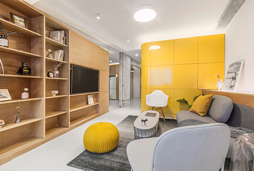
Their immediate response was to design ‘function boxes’ within the space for the bedroom and bathroom, with the spaces around and between designated as ‘activity areas’.
The apartment thus transformed into a continuous space surrounding the boxes, with the vibrant yellow kitchen cabinets creating a central focal point. However, it soon became apparent to TOWOdesign that while the boxes solved certain problems, they also created a new one — that of interrupting the flow of the space and blocking sightlines.
The solution devised by He and Zhang was to rotate the positioning of all the functional boxes by 10 degrees. This seemingly minor adjustment had a dramatic impact, not only releasing the spatial flow but also extending the space dramatically.
In addition, the 10 degree rotation resulted in a number of interesting intersections. For example, next to the ‘sleep/rest box’, the intersection created a space which was ideal for the installation of a staircase with storage cabinets hidden beneath its steps, making it both flexible and practical. Meanwhile, in the living room, a triangular light box was installed into the space created by the intersection, providing additional illumination and creating a warm, welcoming ambience.
Given the overall compactness of the apartment, storage was a particularly pressing issue. TOWOdesign responded with a scheme which therefore prioritised storage areas, with these occupying the largest volume. Further storage capacity was also introduced in a variety of ways, such as hidden cupboards and drawers, push-pull and display shelving. In the open kitchen, a foldable dining table and hidden toilet maximise the use of every available inch of space.
Mirrors were also used to reflect light and relieve any sense of oppression in such a small space. However, in China, it is considered taboo to view oneself in the mirror while you are in bed. Taking this into consideration, He and Zhang played with the angle and position of a variety of mirrors to address visual spatial extension while simultaneously sidestepping any related taboos.
Finally, the designers retained a portion of the original pillars and walls, exposing them to show off the outline of the building.These pillars also provided and exact reference to the 10 degree rotation, making the space more interesting. In conclusion, while respecting the nature of the space, TOWOdesign achieved its aim of enlarging the space through creative and practical design methods.
8-14 Cape Road
If it’s views of both hills and the sea you’ve been dreaming of, this four-bedroom apartment in Chung Hom Kok offers all that and more. Part of a low-rise development, this 1,481 sq-ft residence also includes a substantial terrace area, and a very high efficiency ratio of 82 per cent.
High-sheen wood flooring creates a warm palette that unites the various spaces, from the sleek, high-tech kitchen to the capacious master bedroom with ensuite.
A Private Residence
Overarching trends in high-end interior design today are easy to spot. From a carefully neutral colour palette to a materials palette (usually dominated by glass to chrome to brass and marble) distinguished by the concept of high shine, it is almost by unspoken agreement among clients and designers that certain things unequivocally signal ‘luxury’.
Daring to make a break from this is JAMD Architecture’s founder, architect and interior designer Huang Jiexin. Already renowned for his minimalist aesthetic when it comes to interiors, he took the opportunity to showcase subtle moves in new directions when designing his own residence.
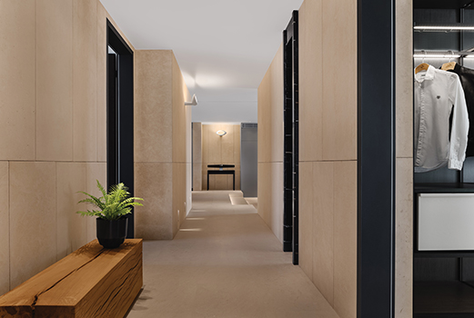
At first glance, the apartment’s dominant beige colour palette and the extensive use of marble on floor and walls could be considered the normal indicators of opulence. Look a little closer, and you notice that the marble has in fact been delustred: gone is the high shine and in its place is a muted sheen, the grain of the stone laid bare for appreciation.
Glance toward the kitchen and a sudden burst of colour greets you. Here, a vivid, cheerful lemon yellow on the walls is paired with cabinetry in a rich, deep anthracite; two overhead pendant spots highlight the stainless steel work surface of the countertops.
This daring sidestep into pops of colour are also seen in the bedrooms. Here, however, the rich turquoise blues and deep cherry reds are expressed through accessories, artwork and bed linens; a nod, perhaps, to the primary function of sleep quarters as places of rest and respite.
Huang designed his apartment without superfluous adornment. The furniture selected is modern in its sensibility and minimalist in style, while contrast is provided by door- and window-frames in black. Wood is introduced for its tactility and warmth, from the chunky bench in the lounge to the sleek table and chairs in the dining area.
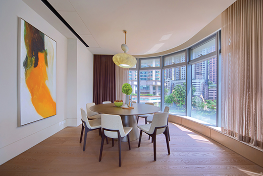
Cabinets in neutral colour subtly hide appliances and mechanical systems, permitting continuity of storage and concealment throughout the major living spaces and corridors. Large French windows introduce natural light, in some cases providing stunning dual aspect views – as can be seen on opposite sides of the open living/dining area.
Natural light is complemented by a range of concealed lighting in ceilings and walls as well as statement pendant and floor lamps. They emphasise the perfect proportions of the space while creating delightful visual experience.
All in all, the project not only functions as a residence but also speaks to a certain lifestyle and an aesthetic which Huang continues to hone and explore.
Argenta
Midlevels West has become one of the most sought-after new locations for high-end living in Hong Kong, exemplified by the Argenta complex on Seymour Road. This 2,123 s.f. apartment boasts three generous bedrooms, including two ensuite, and was completed in 2013 to include stylish, modern fittings and finishes.
With its balcony and ample full-height glazing throughout, the wide-ranging views encompass not just the city, but Victoria Harbour as well.
Artland in Shanghai
TOPOS Design Clans was approached by the Chinese interior design and renovation TV programme Change Your Life and challenged to create a unique home art studio in a rental apartment spanning 80 sq-m.
Located in a high-rise building on Fengyang Road in the old town of Shanghai, the apartment was to house an artist and his wife, and their two pet dogs. TOPOS’ principal architect Lin Chen wanted to create a ‘realistic Utopia’ which would also serve as a prototype for a new lifestyle for his clients.
“Thinking out of the box, we imagined the new living room as an unusual space; a container for life and art,” says Lin. The colour palette here is predominantly black and white, acting as a three-dimensional canvas “with life providing the colour for it”, he explains. “The grey ceramic tiles used for the floor are easy to clean, and the original texture feels raw but real.”
The PVC ceiling is ingeniously designed to offer three different types for lighting as the residents require: for painting, for exhibitions, and for general day-to-day living. In the corner space beside the entrance, cabinets provide storage for the client’s art tools, and also conceal a 2m-wide movable partition which can used as a display or gallery wall.
Storage is a key element throughout the apartment, ranging from a peg board for model kits, a bookcase below the window, corner cabinets for large paintings, a hidden shoe cabinet and a small niche by the front door for keys and dog leashes. Additionally, a large bespoke multi-functional table performs dual duties as craft table and seating for dinner parties.
In the centre of this apartment, a golden kennel for the two dogs features a façade decorated with an abstract, pixellated portrait of them. The kennel also multi-tasks by providing space for art installations. The gold cladding continues along the corridor, which becomes an extension of the gallery, while three concealed doors lead to colourful private rooms whose essence is encapsulated in their inspiration — ‘green jungle; blue sea; pink love’.
Green handmade tiles are used in the bathroom; where a salmon pink toilet provides an eye-catching centrepiece. In the kitchen, blue provides a vibrant backdrop for the yellow wall pegs and lamp; while the pink-hued bedroom is light and airy, and the epitome of romance and love. Artwork by the client also carries the pink theme in pops of colour throughout the rest of the apartment.
Inspired by the client’s comment that “the future is pink, and pink is love”, graphic designer Suzy Zhang designed a pink household logo based on the numbers seven (the client’s lucky number) and 11 (his wife’s nickname).
In the conclusion of the TV programme, the design team organised a private art exhibition for their clients, much to their delight. “Life is hard, but we should never forget our dreams and love,” explains Lin. “The purpose of design is to make life better.”
Ballymagarry House
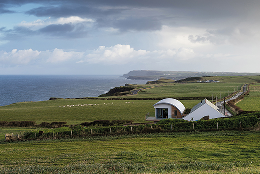
Set in an officially-designated Area of Outstanding Natural Beauty, Ballymagarry House, with its modern sustainable and super-insulated straw bale and timber frame extension, is nestled into its terrain, taking its cue in both form and materials from the agricultural heritage of its surroundings.
The site consisted of a derelict blacksmith’s forge and the crumbling ruins of an attached blacksmiths cottage, both over a century old. Sitting on the edge of a country road, but benefitting from some of the best coastal and rural views on the North Antrim Coast, the property is blessed with sweeping vistas from Donegal to Scotland.
The concept involved the conservation of an old forge and rebuilding the ruins of the original dwelling, creating a visual barrier for an accommodation block with a modern, highly glazed curved roof to sit behind. These two blocks are only visible together when viewed gable on; the two gables create strong basic shapes that are can be seen in the agricultural buildings throughout the Irish countryside.
2020 Architects and the planners wanted to retain as much of the original forge as possible, conserving the character which would help to ground the design in the Irish vernacular. The curved roofed element of the extension was a solution to the need for two storeys while still being lower than the roof of the original forge.
The two strong forms are divided by a flat-roofed section planted as a wildflower meadow. Due to the sloping nature of the site, the building increases in height as you drive along the road from west to east; this is an original feature which the design team wanted to use to enhance the drama of design internally.
The completed house creates a guided journey from the moment a visitor arrives on site: it unfurls slowly, leading the visitor through differing scenes. The dwelling is approached from the lower western gable, where the flat roof of the dividing section is at eye level and the two strong forms frame a long view over the wildflowers towards the grassed field and sea beyond. This view and stepped path guides the approach to a very human scale front door between the two extruded forms.
On opening the front door, a 16m-long wall of natural unpainted stone pulls the eye into the depth of the house. This 500mm-thick stone wall was partially rebuilt using the original stone from the site, utilising traditional masonry skills. The wall is a ‘touchstone’ for the house; it can be viewed from all but one room and continually ties the modern house back to the history of the site.
The wall increases in scale as you walk down a corridor created by the wildflower roof above and between the two strong competing forms of the building. The tension of these two spaces sets up much of the drama of the house, the curving wall of the modern extension pushing against the heft of a massive stone element.
The stone wall is punctured as little as possible to form openings to bedrooms and utility spaces beyond. In all, the house is on seven different levels, ensuring that it integrates discreetly into the undulating fields which surround it.
Boundary
When it comes to design of any sort, restraint can often be the hardest challenge for a designer. For centuries, the rich have had the luxury of choice: to flaunt their wealth, or to exercise modesty. Just look at the court of the legendary ‘Sun King’ Louis XIV of France, who transformed a royal hunting lodge in Versailles where he had played as a boy into a monument of royal opulence — no gilding was too flashy, no flounce too flamboyant. It remains a style still beloved by many to this day, but there are just as many who prefer a more low-key approach.
For one of Wei Yi International Design Associates’ clients, an elderly man rich in both wealth and experience, the definition of ‘home’ was more about a delicate balance between comfort, tenderness and purity, than of showing off his material achievements.
“Technically speaking, the rationality of Modernism is the main axis in the overall planning of space; while from the perspective of spiritual essence, it interprets Zen and wabi-sabi (a world view centred on the acceptance of transience and imperfection) based on Confucianism, Taoism and Buddhism,” says Fang Xin-Yuan, founder of Wei Yi International Design Associates.
Grey dominates the main colour palette. Exposed concrete walls are tactile and industrial, yet simultaneously smooth and calming. The Pandomo floor is sleek and clean with a minimalist feel. In the lounge area, black wood shelves appear to float above the wall-mounted cabinet, while hidden lighting beneath the ledge raised just a few inches above the floor adds a discreet glow.
Spot colour is used judiciously. Fang notes that red, yellow and blue tend to be popularly regarded as colours traditionally favoured by royalty; for this project, the design team selected blue for its “quiet elegance and deep sensibilities, which perfectly convey the owner’s state of contentment spiritually rather than materially”.
Throughout the space, grey makes its presence felt via materials such as exposed cement and grey-black veneers. Judiciously chosen colours of low brightness and low chroma are also seen in the structural space, highlighting what the designer refers to as “imperfect perfection and irregular order”, which he explains are entirely dependent on the individual: “Perfect or not, it completely depends on the standard in one’s heart, as do the perception of Earthly troubles and innermost peace.”
In the dining area, a large blue wall in the shape of the Chinese character ‘#v’ features an uneven and irregular lacquered surface. Meanwhile, the partition wall separating the space from the lounge and forming a corridor wall acts not just a spatial division, but also as spiritual boundary, “as if Earthly life and pure land are separated by a line”.
Fang concludes: “It is where the simplicity of Song dynasty aesthetics is integrated in the treatment of details. [A home] should not just be a designer’s arena, but the expression of the inhabitants’ deepest thoughts and beliefs.”
Boundaryless
In cities throughout China, older districts which have not yet been targeted by developers are rife with ramshackle townhouses filled with potential and with the past. Making the most of both can often be a challenge as Thomas Xie, executive director of Inspiration Group and design director of Inspiration Studio, found out.
Invited to renovate a family residence in Guangzhou, the third-largest city in the mainland, he set out to create a home which not only offered style and modern convenience, but would also narrate the personal history of his clients.
Built in 1919, the matriarch of the resident family had lived there since she was nine years old. It was here that she and her husband watched their five children grow up; today, she shares the house with her fourth son and his wife, and her youngest grandson. At holidays and festivals, up to five more members of the family return home for celebrations.
Located in Guangzhou’s old CBD, the three-storey townhouse was hampered by its design: long and narrow, little natural light or fresh breezes could enter. Over the years, termites and damp took their toll, while the boundaries caused by the many separate rooms meant spatial flow was basically non-existent.
With the family spending the bulk of their time in different rooms, interaction was limited primarily to mealtimes. Xie’s first move was the remove these artificial boundaries to “let the light and people in”, while taking care to still respect the need for privacy for each resident.
To reconnect the myriad rooms, the team first set about demolishing load-bearing walls and rebuilding steel structures in order to change the entire floor plan. A ‘core tube’ comprising stairs and an elevator was introduced, and further non-functional boundaries removed.
The result of this is that residents can walk freely and interact with each other in the house; plus, by utilising the front and backyard, skylight and open space, natural daylight and ventilation now flow throughout the space. Versatility extends to how a room can be used: the kitchen, for example, transforms from a closed, Chinese-style cooking space to an open, western version by the simple rearrangement of sliding doors.
Although the client’s husband has passed away, his presence is still very much an important part of the family’s lives. Having returned to China during World War II, his equal skills in engineering and art (particularly the Cantonese school of drawing), as well as his spirit, had a lasting influence. That their home would appropriately commemorate his memory was therefore of utmost importance.
Xie responded by creating a room with staggered floors between the second and the third storeys. Here, the family gathers to watch their old videos using a projector, remembering and appreciating their father, and listen to his stories again as if he were still with them.
With all bedrooms located on the second and third levels, a variety of intersects, created using cavity spaces, opposing windows and specially-positioned doorways, offers the family both privacy yet a sense of togetherness.
A large courtyard ensures that sunshine can reach the home’s inner depths, while the stairway and elevators offering a physical link between the different levels. Small lacunas liven up each hallway, while a workshop on the top floor retains the original patterned tiles, old book cabinets and swivel chair from the Republic of China era.
In all, 27 items of the family’s treasured antique furniture were sent to master craftsmen for restoration, ensuring that the history and memories embodied in these pieces will continue to live on for generations to come.
Brace House
Located in the significant heritage precinct area of Melbourne’s Albert Park, Brace House converges two architectural styles, thanks to its a heritage protection overlay on the street portion of the home. Finnis Architects was approached by the home-owners to open the house up, with the aim of maximising light and available living space.
Finnis felt it was crucial not to ignore but rather celebrate the classic Victorian terrace home: “The opportunity to design a home with two different architectural styles working harmoniously, while staying individually dignified, was paramount.”
The structural components of the new dwelling was used to support the existing terraces to the north and south, which was achieved both structurally and visually with the use of concrete columns and beams. The heritage-protected front façade was retained, while the entire site was excavated to the depth of one metre to allow for the architects’ proposed design.
This new design supported the structure’s heritage values and set the foundations to increase the floor area without compromising openness. This prompted the incorporation of mezzanines and half levels to ensure the feeling of grandeur was retained.
On entry, the light colour palette of the ground floor interior is revealed with the materiality of the polished plaster and the blonde, Douglas fir timber floorboards. The polished concrete sunken lounge at the front of the home visually connects the concrete treads on the main staircase, increasing ceiling height and adding wall space for the client’s artwork.
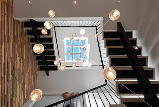
The dwelling’s setting in the middle of a row of terrace houses limited the options for typical resolutions to natural lighting, effectively paving the way for a number of bespoke details. One of the main features of the design is the full-height, three-storey void which filters light through the heart of the design and doubles as the home to the centralised custom stairwell. The 40 lights which delicately step down through the void accentuate this space as the core of the home. A grounding brick clad feature wall guides the user upwards to create an atmospheric experience.
The rear façade of the house is clad in zinc and render, which is deliberately mirrored on the laneway studio as the courtyard’s dark colour palette balances with the softer timber tones of the boundary fencing and travertine pavers. These features, combined with carefully considered vegetation and the calming tranquillity of the pool, tie the zones together, creating an urban backyard oasis.
C House
When it comes to our homes, we’re used to colour palettes which run the gamut from earthy neutrals to soft pastels or vivid brights. Suggest a theme based on black, and most people would say that’s fine for something like a bar or a club, but a home?
But for senior interior architect, founder and chief designer of AD ARCHITECTURE Xie Peihe, black provides a calm, subtle atmosphere which can soothe anxiety and, he says, “enable people to slow down and listen to their inner hearts”.
Attracted to its dramatic impact, Xie says black is mysterious and alluring, its hidden strength lending people the courage to explore the unknown. “Life is like a drama,” he muses. “At work, we play different roles with different people and things for each scene, so when we return home, what we want is to enjoy a stage that only belongs to ourselves.”
Xie’s approach to C House is profoundly restrained. Using texture as the starting point for the design concept, the resulting combination of black, grey and carefully-planned lighting creates a strong sense of drama. “The centre of this design is people; each element is there to remind people to focus on the present moment. In this drama about the home, the leading role is played by you,” says Xie.
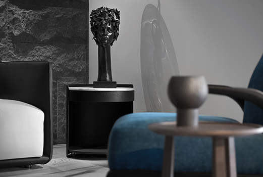
In the living room, the wall behind the black-framed sofa is made up of individually hand-cut stone blocks, softened by the addition of a large, striking painting of foliage. This sense of balance can be seen throughout the residence: the artwork, for example, injects humour and quirkiness — like the metal sculpture of a mannequin which stands perfectly still, a silent object which is also “…a witness to the pleasure, anger, sorrow and joy in life”.
The dining and living areas are symbolically separated by a sofa, resulting in a layout which is fluid and open. A large expanse of glass windows bring natural light into the room and create a dazzling mirror effect as it reflects off the tiles, while the use of natural wood in the reception hall adds softness and warmth.
A quiet calmness is expressed in bedroom, where wood panelling and other details echo the wood furniture in the public areas, creating a textured, tactile tone which appeals to the senses. In short, the design — perhaps unexpectedly — encourages its residents to feel and discover through looking, touching and listening.
AD ARCHITECTURE, which launched in 2015, uses a ‘win-win, coexistence, and consensus’ approach as the basis of its design approach. Comprising a collaborative team of like-minded designers, the firm’s main practice includes architectural design, interior design, and soft decoration.
Xie, who founded the practice, has won a number of design awards, from competitions such as the Asia Pacific Interior Design Awards 2017, the IAI Design Award (Shanghai) 2017, and the China International Building & Interior Design Festival 2015.
Of C House and its unusual colour scheme, his sentiments are both rational and poetic: “When night falls, you turn on the lights and the music, forget your exhaustion, and a new drama that returns to life itself begins.”
Cape Mansions
Hong Kong boasts an extensive and beautiful coastline, and Cape Mansion certainly makes the most of its location on a green hillside in Pokulam.
Highly-polished wood flooring creates a welcoming ambience, while the open-plan living-dining area is airy and spacious. The bathrooms have been updated with a stylish flair, including walk-in showers and sleek sanitaryware throughout.
In the kitchen with its white cabinetry and pale stone countertops, huge windows allow in ample natural light.
Carmelia
From its brightly-hued exteriors to a wonderful open courtyard and private gardens, the low-density Carmelia development brings a European coastal vibe to the heart of sunny Stanley on the south side of Hong Kong Island, itself renowned for its ‘beach resort’ feel. Comprising just four townhouses celebrating space and high ceilings, the residences are within easy walking distance of local amenities, including the ever-popular Stanley Market
Chhavi House
One of the key demands affecting the design of Chhavi House was that is must comply with the concept of vastu shastra, ancient Indian design principles regarding space, sunlight, flow and function. Its concepts are not entirely dissimilar to the practice of feng shui, in that both set out to use design to increase a building’s positive energy, as well as attract enhance abundance and prosperity.
On a site located in Jodphur, Chhavi was to be built on restricted plot within a society scheme, encumbered by existing adjoining buildings along its compound walls on two sides, and two roads along its north and east sides. Hence, there was a need to create privacy through orientation of the views, screens and courtyards, as well as through landscape design. The little gardens, decks, waterbodies, sculpture court, skylit balconies and terrace gardens were all designed to enhance its spatial feel.
In a city where temperatures routinely exceed 40 degrees Celsius, the dramatic filigree screen on the exterior of the villa is both functional (protection from the sun and providing privacy) and decorative, a reminder of the traditional jaalis of the region. It looks spectacular at night, while during the day it cuts down the heat and glare from outside.
At the entrance to the home, floating steps create a sense of arrival; imposing wooden doors and double-height volumes call the mind the many palaces, forts and temples set in the stark landscape of the nearby Thar desert.
Internally, Abraham John Architects conceptualised an open dining and living area. Here, soaring ceilings link the spaces, while L-shaped openable windows provide a connection to the courtyard and pool outside. Sliding kitchen doors can open onto the dining room or close it off as required, and lighting plays a key role in creating a completely different ambience within the space once dark has fallen.
On the ground floor are two bedrooms, where concealed doors to the ensuite bathrooms ensure a clean, sleek look. One of the bedrooms opens onto a deck and garden, while the other has a skylit private deck to augment its sense of space.
Another two bedrooms on the first floor have a common landing which appears to hover over the dining room. The master suite is complete with a large bedroom with two seating areas, a skylit green area with cosy bench seating, a dressing area and a large spa-like bathroom. An additional seating area overlooks a private terrace where birds gather, offering a sense of a tranquility amid nature.
A projecting mass over the courtyard houses a temple, with its screen filtering external light and achieving the required privacy for the space. The media room, meanwhile, spills onto a big family terrace; a full-height sliding door can open up the room to encompass the lobby to create an expansive entertainment space.
In terms of materials, local Jodhpur stone was used on the entry steps, water bodies and compound walls. The outdoor textured stone plaster finish matches the colour of Jodhpur stone and is used on some of the indoor surfaces as well, to add to the overall outdoor feel and look.
Costa Smeralda Villas
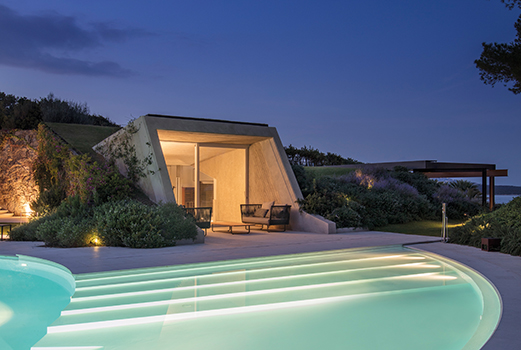
Back in the 1970s, architects Ferdinando Fagnola and Gianni Francione conceived a project in which a complex of villas were built overlooking the northeast coast of Sardinia in Italy. The unstructured yet rigorous volumes slit the ground like wedges, generating an open series of relationships and spaces. On a more poetic level, the villas appear to disappear into nature and blend into the vegetation.
The recent renovation was designed by Fagnola himself together with PAT. studio, as a new ownership purchased three of the five original units in 2011, thus making it possible to to regroup the architectural organism initially conceived. Additional volumes have been made possible by the Piano Casa1, and new recreational and sport-related functions have guided the programme.
The reunification of the distinct properties into a single integrated work was the driving theme of the project, designed for the use of a large extended family consisting of a couple with five children and their numerous guests. This had a decisive impact on landscape design, which involved a great deal of work on removing boundaries and sewing paths.
“The playful function of a house by the sea convinced me to design an open architecture, broken up into many volumes, which in turn composed many empty spaces: a central open area, multi-purpose, around which are distributed the main functions and many other small closed spaces, but in the open air,” says Fagnola.
Villa #1 is the fulcrum that accommodates the master bedrooms, kitchen and main indoor and outdoor living areas. Villa #2 (the ‘Butterfly’) contains guest bedrooms and the main recreation area, comprising a spa, relaxation area and linear swimming pool.
Villa #3 (the ‘Telescope’), the most recent addition, completes Villa #1 to which it is connected by a new staircase and a system of walkways. It is equipped with an alternative dining/living space, guest and staff bedrooms and a teaching workshop where the children can paint, do clay modelling and have language lessons. This space, which was specifically requested by the client, founder of a Montessori method children’s centre, is completed by an outdoor adventure path suspended among the maritime pines, for the development of motor skills.
Landscaping, meanwhile, was designed to limit water consumption, primarily by reducing the lawns in favour of Mediterranean scrub areas which are virtually maintenance free. The lawns, which extend to the green roofs, feature grass-like weeds adapted to be particularly resistant to heat and drought.
Thanks to these choices, it is estimated that water consumption will be reduced by about 70 per cent, making the villas, technologically updated and totally revamped from the mechanical point of view, upgraded to class A status. The task was facilitated by their architectural characteristics: the semi-hypogean volumes and the mass exposed inside favour the natural bioclimatic behaviour of the buildings, reducing their energy requirements.
Elegant Residence
In a world where chaos and clutter are unavoidable in everyday life, a person’s home is often their own private sanctuary, a refuge from the outside world. For Xie Peihe, senior interior architect, founder and chief designer of AD ARCHITECTURE, design derives from life, “so we extract emotional design inspiration and use rational design techniques to start every design from scratch,” he explains.
This enables Xie and his team to “break inertial design thinking and enable people to have different experiences and find joy in every type of space”. The aim, he says, is to create comfortable living spaces that combine tranquility, beauty and different cultures where the inhabitants can find peace and purity of mind.
For this particular apartment, located in a high-end residential community, AD ARCHITECTURE devised an elegant space filled with artistic features which would appropriately reflect the ‘luxe’ positioning of the development.
“‘Neo-Chinese style’ is a prevailing phrase in the industry these days,” says Xie. “We set out to create a space that reflects our design concept, adhering to minimalism, and focusing on emotional feelings rather than forms. When it comes to ‘minimalism’, it recalls Ludwig Mies van der Rohe’s theory of ‘less is more’.”
‘Less’ here meant eliminating what Xie termed “unnecessary elements in the spatial design”, while ‘more’ necessitated the perfect integration of all elements, rather than cluttering the space by using multiple elements simply for the sake of it. “Without unnecessary variations or complicated decor and furnishings in the spatial design, we respected the original atmosphere of the space, refusing exaggerated expressions and instead designing the space in a minimalist style, creating a broader vision for people living there.”
The result is an ideal balance between slackness and tension, which looks deceptively simple but in fact fully manifests the client’s tastes and preferences. The overall layout is indicative of her living habits and hobbies, set against a light colour palette which imbues a sense of serenity to the space.
A bookcase in the hallway provides aesthetic storage for the client’s collection of reading matter, while a long wooden desk provides an ideal spot for the practice of calligraphy, long considered the embodiment of Chinese cultural heritage. “It is said that people can meditate through reading; thus the design of the hallway actually helps people to maintain their inner peace,” Xie says.
The living room and dining room are both concise and simple, perfectly integrated via the concept of ‘blank space’ in the design. The bedroom is more of an expression of emotion, presenting a tranquil atmosphere to provide the perfect setting for the client’s hobby of playing the guzhen, a traditional Chinese instrument. “Quiet beauty and feeling of purity make the bedroom a place to heal mind and soul,” Xie concludes.
Falconer Street residence
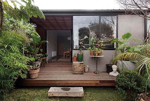
At an elegant property on Melbourne’s Falconer Street, Sonelo Architects were asked to create an alteration and extension to the period, single-storey Victorian terrace house. According to Sonelo co-founder Wilson Tang, the main design intent was to open the house to the garden and daylight.
The existing house is sited on a corner allotment with a generous cobbled stone laneway on the side. The long, linear layout, with a series of room located side-by-side accessed off a dark hallway, is often the unappealing aspect. By opening the rear part and adding a timber porch, the house acquired a new outlook to the garden and a ‘light at the end of the tunnel’.
With minimal yet clever intervention to the interior layout, a new kitchen-diner and home office embrace the garden and the bluestone laneway at the side. “Being connected to the landscape is integral to our work,” says Tang. “It brings serenity and calmness. Conceptually, this was a relatively straightforward project. However, due to the heritage overlay on the property, it became a protracted process because approval from the planning authority was required.”
The intervention has create a deceptively spacious home office, in which a frameless corner window carves a quaint view of the garden. Seasons are invited into the house, the workplace of the owner and her staff, while fine lines and pared-down details are paired with earthy, robust materiality to strike a balance between form and function.
Tang says their client was the inspiration for the colour palette: “We searched for a combination which is effortless, earthy, crafted, warm, and contemporary. The green panelling, dark timber floor, stainless steel benchtop and white walls provide just the right balance,” he says.
“It is an important part of our work that any spaces we design conveys a story of our client and the site.”
All the existing structures were salvaged and altered minimally to achieve the largest effect. A new steel window and door were carefully inserted into the existing brick wall. The existing floor in Baltic pine was salvaged, reconditioned and refinished in a dark stain which enhances the character and patina of the timber, giving the interiors an aged, cosy yet elegant and contemporary finish.
To create a new larger opening for the bi-fold doors leading into the garden, an existing window was removed. The sill to the window, a thick bluestone, was salvaged and reused as a floating step to descend from the new timber porch into the garden. Lined with timber battens, a light-filled veranda has been inserted between the new kitchen-diner and the garden, serving as an inviting and subtle transition between inside and outside.
“A sense of openness is exuded by the finely-framed steel doors, which quietly leads one to interact with nature,” Tang adds. “Often, so effortlessly and accidentally, the owner and her staff find themselves savouring a moment in the sun, the breeze, and the garden.”
The new porch is constructed from recycled spotted gum timber, utilising a variety of board sizes to create a range of textures. Wider, flatter boards with tight gaps are used for the decking, while narrower, thicker boards with large gaps are used for the wall and roof, allowing daylight to softly stream through, creating a dance between light and shadows.
“The kitchen, meals area, study/office, and the garden are now interconnected,” Tang says. “Our client, a talented landscape designer, is connected to her element all day round while working or resting… A beautiful union!”
Fontana Gardens
Positioned perfectly for the bustling dining and retail hub of Causeway Bay, this meticulously decorated apartment in Fontana Gardens features high ceilings and generous room sizes.
With separate living and dining areas, there are four bedrooms in all, including one ensuite, with an extremely high efficiency ratio of 90 per cent. Fascinating views of the urban surroundings come into their own at night, when the city bursts into life with colourful lights.
Happy Valley Residence
An inter-disciplinary architectural design practice founded in New York City, Lim + Lu is the brainchild of Elaine Lu and Vincent Lim. Currently based in Hong Kong, the practice’s designs are inspired by simple vignettes from everyday life. Working with clients around the world providing architecture, interior, graphic, furniture and product design services, the pair focus on individualisation in every piece and project.
Noted for their ethos of flexibility and practicality, Lim+Lu brought a breath of fresh air to a 1,200 sq-ft apartment located near Hong Kong’s famed Happy Valley Racecourse. Reflecting their versatile and colourful design aesthetic, the apartment’s transformation alludes to a flexible living environment that reflects the versatility required by modern day living.
The first step was to rethink the way that space was allocated within the apartment. Hong Kong is renowned for its urban density, and this has led to the creation of ever-smaller residences and cramped layouts as developers seek to squeeze as much as they can into every available square foot of space.
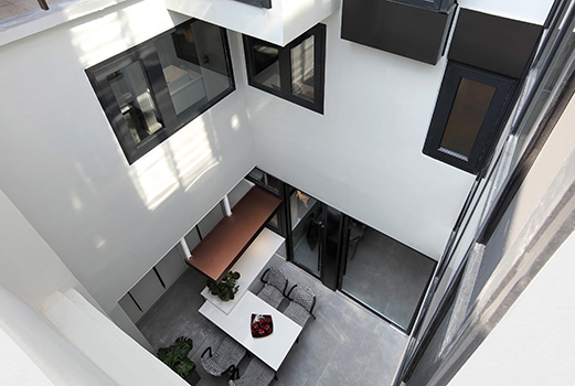
Lim+Lu responded to the challenges posed in their dwelling by removing and restructuring the walls within the space; the resulting interior is strategically designed to appear more expansive. By replacing the walls that had compartmentalised the apartment with glass and steel sliding doors, natural light is now able to pass through from room to room, flooding the newly reconfigured flat.
The overall aesthetic is clean, fresh, and sophisticated. Though evocative of a loft’s spatial continuity, Lim + Lu aimed to avoid any association with the now ubiquitous New York industrial style. Moving away from the ubiquity of industrial-chic, the pair deliberately chose hues that would inject fresh life into the space.
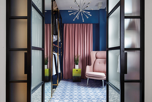
The walls of the living room and bedroom are painted white with black accents, signalling spaces of rest and relaxation. Meanwhile, the kitchen, study, walk-in closet and master bathroom are host to rich pastels and dark jewelled tones, tastefully combined with patterned ceramic tiles to juxtapose the core living space with the extensions.
Transitioning from their earlier furniture pieces, Lim + Lu has carefully constructed their apartment-showroom to adhere to today’s sought-after flexible way of living. The pair have used this particular aesthetic framework to complement their newly-launched namesake furniture pieces which feature prominently throughout the space.
The thresholds created by the subtle distinctions of colour, texture and material maintain a fluidity to allow the space to blend effortlessly together as one.
Headland House
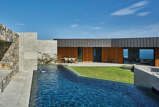
A stunning 150-acre property with sweeping views over both green pastures and paddocks on one side, and rugged coastal cliffs and ocean on the other, Headland House is a four bedroom, four-and-a-half-bathroom main home consisting of three linked pavilions.
The stacks are wrapped around a protected courtyard, while fingers at each end cantilever toward specific framed ocean and rural views. Clearly inspired by the spectacular landscape, Atelier Andy Carson wanted to create a respectful celebration of the location. Instead of providing the same view throughout the house with wall-to-wall glass, the design creates considered framed glimpses of the outside — and a storm-viewing room pays tribute to the drama of extreme weather fronts creeping up from the ocean.
What sustainability features have been incorporated into the design?
Passive solar, extra thick highly-insulated walls, doubleglazing, rain water harvesting (off grid), with UV filtration and treatment, on site sewage treatment, and supplementary solar power.
What were the key challenges?
The prominent exposed site required a response that dealt with the problems and opportunities of the site first and foremost: how best to respond to the dramatic south-facing hill devoid of trees, fully exposed to weather events from the nearby ocean? How to deal with the overwhelming 180º views? With the strong ocean, beach and lagoon views, how to avoid ignoring the rest of the 150 acre property?
What were the solutions?
The primary intervention was to create a protected courtyard house around which are wrapped three extruded pavilions, forming an open ‘U’ shape to the north. This provides refuge from the bitter southern winds and storm fronts. Large retractable sliding doors allow fine tuning dependent on weather conditions.
The pavilions are heavily articulated, morphing and twisting towards views, sun and protective opportunities. The extreme ends of the two main pavilions focus like telescopes on the ocean and the farmlands respectively. The building forms a transition from the rear courtyard wall cut into the hill out to the tips of the volumes reaching out to the landscape with the hill falling away beneath.
Views are broken into highly considered picture frames that highlight and introduce new points of interest in the landscape. The courtyard, with its fire pit, pool and garden, offers controlled views through the pavilions toward large swathes of ocean, offering huge prospect from the most private areas.
Several measures where employed to minimise the visual impact of the prominent position. The articulated form, dark black cladding, stone podium and siting cut into the hill all minimise these impacts when viewed from the opposite end of the beach. The property previously included the nearby headland, and several metres of the eastern coastal boundary were provided for public use and enabling the Kiama to Gerringong coastal walking track.
The built form is directly shaped by the relationship to the site location and context. If the project site was moved even a small distance away, the same design approach would have resulted in a very different result.
Hide Out
Located in the ‘Little Osaka’ neighbourhood of Los Angeles, California, this spacious residence was formerly owned by noted Los Angeles contemporary art collectors Edwin Janss Jr and his wife Ann. They had commissioned architect Frank Gehry to design the original house in the 1970s, but eventually modified his design, eliminating many of his signature details.
Although Gehry’s vision wasn’t fully realised, this is considered to be his first single-family project. The house eventually became a gallery-like setting for the Jansses’ parties, fundraisers, and private art collection, essentially becoming a hub associated with the contemporary LA art scene in the 1970s and 1980s.
About 25 years later, Dan Brunn, AIA, principal of Los Angeles-based Dan Brunn Architecture, was tasked with redesigning the residence. He started by gutting the entire first floor to create an open-air plan that accommodates work and display space for the owner, artist James Jean, as well as domestic necessities.
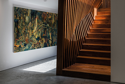
Interiors are arranged around an existing oversized rectangular skylight, while new windows were added to bring additional natural light into the kitchen and living areas. Brunn created a dynamic undulating staircase wall and utilised primary building materials such as wood, concrete, and glass as a nod to the architectural shapes and material palette famously used by Gehry at the time.
Upon arrival, a walnut wall leads into the living room, with a slight protrusion into the walkway. The shifting shapes and angles are in homage to Gehry as well as to Jean, who features flowing arabesques in his detailed work, beckoning one up the dynamic, handcrafted stairs which capture light throughout the day, accentuating the golden tones of the wood.
Brunn instilled a feeling of openness and continuum throughout the first-floor home/work space. Interiors are meant to serve as a gallery-like setting for the homeowner’s art displays. The rectangular skylight — the only architectural detail executed from Gehry’s original plan — was re-thought, now outfitted with LED lights and stretch fabric to create an ambient glow.
Minimal furnishings define rooms within the open plan. A charcoal-coloured area rug demarcates the conversation area, bound by an Italian sofa and two black-and-tan leather sling chairs designed by Jean Prouvé in 1930.
The reclaimed timber coffee table is custom-made using traditional Japanese joinery, a fitting counterpart to the fine, intricate lines of a large artwork by Jean that overlooks the living area.
Upstairs, natural light seeps into the stairwell tunnel through a glass-enclosed open-air meditative garden accessible through the master bathroom.
Previously boxed in with no access to the outdoors, this area was designed as a garden space by Brunn to acknowledge Gehry’s original intention to make the area an encased greenhouse.
At the far end of the house, a 14ft x 12ft pivoting wall either hides or reveals a multi-purpose room. A built-in Murphy bed emerges from the floor-to-ceiling bookcase to transform the library into a guest room. Here, the show-stopper is the wooden, box-like volume designed by Brunn, with canted walls that radiate out from the floor-to-ceiling sliding glass wall.
A lush garden area is visible and accessible through the glass sliders, while copper panelling clads the exterior of the volume, which was inspired by Japanese tea-houses. The garden, with its traditional species of bamboo, gingko and Japanese maple, was beautifully conceived by Hitoshi Kitajima of Kaisei-en, who worked at the Tokyo Imperial Palace.
Hillside House
When China first threw its doors open to modernisation as it sought to compete on the world stage, there was a large influx of migrant workers who left the countryside to seek employment in the big cities. Over time, some of these young folk have decided to return, leading to something of a construction boom in traditional villages.
For China’s new generation of rural migrant workers, a self-built house in their home village was a both a symbol and a signal of their success. Ironically, most of such homes remain vacant after being constructed, their owners then returning to the big city. In the case of Hillside House, however, the client intended to remain. Having built a career in Guangzhou and Shenzhen, she yearned for the familiar sounds, surroundings, foods and memories of her childhood.
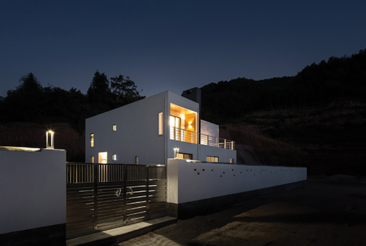
Hillside House is set on the edge of the village, adjacent to a forest park and nearby mountains. It was this peaceful natural setting which inspired Jin Feng, chief designer of Ming Ding Spatial Art Studio. With the vision of a reclusive white hillside home appearing in his mind, he crafted a design scheme based on functionality, to be expressed via a series of simple geometric blocks.
“Although the project is in the countryside, living spaces here have also changed to adapt to our living habits,” says Feng. “We can’t ignore the fact that we are part of modern society.”
Practicality was the primary design driver, taking into account the owner’s living habits. The engineering budget was carefully monitored throughout, as the land was levelled, the courtyard layout determined, structural requirements carefully planned, and both interior décor and detail optimised.
The biggest challenge of village construction is that there is no well-established infrastructure planning. Accordingly, requirements concerning the home’s septic tank and waste fermentation system were considered from the start with a systematic design approach that effectively solved the problem of sewage discharge; with the bonus of creating fertiliser to be used in the vegetable garden.
“Various effluent discharge and waste disposal have had a serious effect on the water sources in the village and even the forest,” says Feng. “If construction [taking place in the village] only takes individual benefits into consideration while ignoring effects on the environment, [the result is negative]. Design must have a responsibility to nature.”
Internally, costs have been kept low by clever use of basic building materials: concrete brick walls, for example, have been painted in white, while a large striking OSB (oriented strand board) wall functions as both background structure and partition. The concrete floor has been designed to resemble tiles, and exposed wiring create a cool industrial tone contrasting with the warm wooden texture of OSB.
Externally, the minimalist characteristics of this white house are markedly different from the indigenous architecture of the village. Its design values were interpreted by transcending the narrow boundaries of the neighbourhood, noting that time would eventually mellow the ‘weird’ into ‘curious’ before finally becoming accepted.
Hoi Fung Path
There’s a definite coastal feel to this two-storey detached home, thanks in part to its location (the highly coveted residential enclave of seaside Stanley on Hong Kong Island) and partly to its cool colour palette of muted blues, greys and earth tones. With its private swimming pool, high ceilings and sweeping views over Tai Tam Bay, this home on Hoi Fung Path is definitely aspirational
Jardine's Lookout Garden Houses
From the Pop Art paintings on the walls to carefully-selected bursts of orange and chartreuse yellow in the furnishings and wallpaper, this garden house in Hong Kong’s Jardine’s Lookout skilfully blends the clean lines of Mid-Century Modern with a joyful, vibrant ambience. With its five ensuite bedrooms, a private garden and an expansive timber-decked terrace, it perfectly encapsulates personal style with a designer edge
Kenne Mansions
If you’re the kind of person that wants to be in the midst of a busy city but also have a haven to escape to, the location of this 2,240 s.f. apartment in Kenne Mansion on Kennedy Road in Midlevels Central is ideal.
With its high ceilings and generous layout, the three bedrooms (with two ensuite) and combined living-dining room feel airy and bright. Efficiency ratio is high at 88 per cent, and there is also a covered carpark.
Mangrove Bay
Perched enticingly on the border with Macau, Zhuhai was declared one of China’s first Special Economic Zones in 1980, setting it firmly on the path to modernisation and gentrification. Today, Zhuhai is renowned for its golf resorts, hot spring resorts, theme parks and islands off the Pearl River Delta. It is against this setting that CCD/Cheng Chung Design dreamed up the showflat for a new residential development, inspired by “…countless fantasies, plenty of sunshine and space, a bed and bathtub [in which you can] stretch [out] and even switches and door handles [that feel good to] touch”.
Just the name itself is evocative: Mangrove Bay. While the city itself continues to experience rapid growth, it also retains stunning coastlines, peaceful islands and huge swathes of natural greenery. Amid all this is the record-setting Hong Kong-Zhuhai-Macau Bridge which, at 55 kilometres long, is the world’s longest sea crossing of its kind. Opened in 2018, part of it includes a 6.7km undersea tunnel, China’s first offshore immersed tunnel and the world’s longest immersed tunnel for road traffic.
It follows logically, then, that CCD’s design for the Mangrove Bay Citic show apartment is similarly ambitious. The driving point for the design was consideration for its occupants, aiming to provide not just an escape from the busy city after a hard day’s work, but also a cocoon from which to emerge refreshed the next day.
The Mangrove Bay Citic Zhuhai is set on the west bank of the Qianshan River, offering a degree of seclusion from the city which has provided inspiration for the interior design. Blending space, culture and art, the result is both spacious and gracious.
A minimalist, chic ethos permeates throughout, appealing to both the traditional Chinese aesthetic and the needs of modern urban life. The spatial relationship has been interpreted with simple lines and veneers, combining a range of materials to emphasise contrasts while creating the feel of a classic mansion.
CCD also drew from a quote by the famous designer Coco Chanel, that “…luxury must be comfortable, otherwise it is not luxury”. Hence, the welcome fireplace in the entrance hallway for warding off the chill of cold winter days; the floor-to-ceiling glass window leading to a curved balcony; and the sweeping views beyond.
Warm wood veneers are juxtaposed against cool marble floors and feature walls, while sumptuous soft furnishings and tactile fabrics and materials are inviting to the touch. Design elements and the design itself emphasises the idea of layering and careful arrangement as one moves through the space. From lines and angles to lighting, materials, and textures, all are perfectly connected.
From the expansive first level, the second floor is accessed via a sleek staircase. The multi-functional design encompasses both private and public spaces, housing not just the master bedroom suite, but also an entertainment space with wine bar and tea room. The warm, earth-toned colour palette throughout offers a neutral canvas against which splashes of colour can be added via accessories and artwork.
Setting a new benchmark, CCD’s Mangrove Bay Citic Zhuhai showflat offers an inviting glimpse into an aspirational lifestyle.
Oblique Box
Working in the airline industry as a pilot and flight attendant respectively, the clients wanted to be able to return to a home which would offer them a respite from busy airports and a hectic, high-pressure work life. Long days and late nights mean that a haven of serenity and peace would be key for them to relax and rest.
Located in Shantou, Guangdong Province, the penthouse apartment offers wide views of the surrounding city. Inside, the space presented AD ARCHITECTURE with a range of challenges, thanks to its variety of slanted, sloping ceilings.
Additionally, a number of rooms within the residence even featured ceilings of varying heights, thanks in part to the architect’s decision to open up certain spaces by removing portions of the upper floor slab.
The overall space is composed of two floors. In general, the lower entry level floor comprises the ‘public’ living functions (lounge, kitchen, dining area) as well as the master bedroom, while the upper level houses private spaces such as the second bedroom and family lounge area. Bearing in mind the nature of their clients’ work, which necessitates the wearing of uniforms and carrying of travel cases, AD ARCHITECTURE also created an independent dressing room and luggage storage are on the lower level.
Removing the upper floor slab above the living room means the space is flooded with natural daylight and ventilation. A massive, oversized sofa/chaise combination provides an inviting focal point, with ample room for lounging or accommodating guests while entertaining. The open-plan room also encompasses the dining area, from which the high-end kitchen leads off.
The removal of part of the upper floor slab has created a gallery on the upper level which is accessed by an open timber staircase whose treads appear to float with only the most slender of balustrades for support. At the top of the landing is a study area, past which is the gallery walkway towards the second bedroom, storage areas, family bathroom and family lounge area.
It is in the latter where the ceiling takes on its most dramatic persona, swooping low on either side of the arched window to create a vaulted effect. The result is a space which is bright yet cosy, with another generously-proportioned sofa/chaise arrangement offering comfort and respite – given that the couple often work separate shifts which often see them returning home at different times, this also doubles up as an unwinding area where each can retire to without disturbing the other.
Both the materials and colour palettes exude luxury. From the soft tactile beige leather of the sofa in the main living area to the blonde wood veneers, a warm tone balances the austere range of minimalist hues, which range from white to pale grey.
With its pared-back approach, AD ARCHITECTURE has created a minimalist yet welcoming home. The design focus fell primarily on dealing with the relationship between people and the elements – air, wind and sunlight – rather than the decoration and furnishing of the space.
Pearl Garden
If you want it all, Hong Kong’s Mid-Levels is the place to be. Just minutes from the heart of the city, the district is noted for its verdant hillsides and views all the way to Victoria Harbour. High ceilings and an equally high efficiency ratio are the order of the day at this 2,100 sq-ft Pearl Gardens apartment on Conduit Road, where the living, dining and kitchen areas have been opened up to create a vast yet carefully proportioned space. Muted earth tones and a wonderful pale wood floor set the tone for cool sophistication
Penthouse18
When faced with their existing two-bedroom apartment with its poorly-planned layout and little generosity of movement and proportion, Stukel Architecture’s clients, a couple from France and New York, set out to make bold and unexpected choices for their Sydney chapter.
Architect Daniel Stukel Beasly, director of Stukel Architecture, says the project was unique in that the design is “less concerned with creating a sanctuary for the occupants, but rather to draw the public life of Surry Hills up into this penthouse apartment. The spaces are deliberately commercial but quirky, as if a visitor has stumbled upon another small, hidden Sydney bar.”
One of the property’s most significant assets is a very large roof terrace, offering views across the southern Sydney central business district skyline. This determined much of the choices made in planning the new flow through the apartment.
Firstly, the new floorplan was designed to connect all new fixtures to the existing services of waste, water and power. The positioning of the wet areas and kitchen thus avoided the potentially disruptive and expensive process of core-holing through the concrete slab into the ceiling space of the neighbour below.
As all the internal walls were non-load bearing with a concrete frame at the building perimeter, this allowed the majority of the interior to be stripped out and re-planned. However, major existing essential service risers were unmovable. These have been used as fulcrums or pivot points from which the new joinery attaches, creating the dynamic pantry, bar and entry sequence that shape and direct the use of the space.
The kitchen has been placed in the centre of the layout and is ambiguous in its extent, encouraging living around the preparation of food. With its two ovens, the kitchen thus takes pride of place in the heart of the home. As the only means of access for both the demolition and construction was via the standard passenger lift, the new works were designed to be disassembled, transported and reassembled for installation.
Additionally, ceilings were stripped back to concrete with exposed sprinklers and lighting to create an upbeat ‘New York basement bar meets Surry Hills warehouse’ design vibe for the young owners. “The clients were interested in transforming a rather mediocre apartment into an incredible place of cooking and entertaining, taking advantage of its roof-top position and city views,” explains Stukel Beasly.
“They had previously been living in New York City, and were accustomed to a fast-paced urban existence. They valued time spent with friends over good food and wanted a space to entertain and host. Thus, the functionality was to be designed into their current apartment, rather than seek the suitable existing dwelling.”
The result of the revitalisation of Penthouse 18 for a contemporary and dynamic couple within an existing ageing apartment building has been the extension of the useful life of this structure.
Pyramid House
Set on a breathtaking plot between a mountain forest and a lake in Finland, the client wanted a house full of distinctive character which would offer contemporary lifestyle comforts. Also wishing to establish a close connection with the site’s natural features, a solution was found in a wooden building designed around a pure geometric shape, balancing clean contemporary lines, traditional materials and complex spatial solutions.
Built on a steep plot facing the lakeshore, the villa, designed by Helsinki-based Void Architecture, takes advantage of the outstanding beauty of its surroundings by creating specific connections for different seasons and activities.
The main feature of the house is the fully-glazed observatory at the top of the building, offering elevated and unobstructed views for miles around. Conceived to appreciate the peace and quiet of those views, the observatory also acts as a peak which dominates the internal spaces of the house as a whole. Representing the focal point of the building, the internal spaces are flooded with natural light from the apex of the pyramid.
Below, the glass-walled, double-height main living space is split into two levels to better adapt to the steep terrain and clearly define its internal functions. An elliptical staircase wraps around a stone fireplace, providing access to the balcony level.
Terrace decks articulate around the whole perimeter of the building and are laid on different levels, mimicking the pace of the surrounding landscape. The timber frame construction, clad in spruce, is insulated with natural materials to achieve a thermal performance that guarantees an optimal level of comfort even during the frigidly cold Finnish winters.
Other facilities comprise a gallery kitchen, guest bedroom, sauna and two bathrooms.
According to Paolo Caravello, architect and lead designer at Void Architecture, the biggest challenge was to design a house that would combine the features of a pure geometric shape with the practical needs appropriate to a contemporary lifestyle. “Fitting the house responsibly in a place of remarkable natural beauty was also an aspect that took a lot of consideration,” he notes.
Particular attention was given to indoor air quality, with walls insulated using naturally-produced wood fibre and paper. Beams and columns were laminated using non-toxic glues, and the house is equipped with underfloor heating combined with ground-source heat. “The house achieves a high level of thermal efficiency thanks to the performance of the outer walls and roof,” the architect says.
Additionally, temperature and lighting levels are automated and can be regulated remotely via an internet connected smart system. This feature guarantees the most effective use of resources at any time.
“The early choice of developing the design around the pure shape of a regular pyramid gave us the opportunity to explore the connection between a clearly man-made object and the inspirational beauty of the site,” says Caravello.
“It was a process of balancing divergences and affinities.”
Quarry Bay Residence
When Elaine Lu and Vincent Lim, founders of multidisciplinary design practice Lim + Lu, first crossed the threshhold into their client’s flat, it was like taking a step back into the past. Left untouched since its previous owner emigrated from Hong Kong more than 15 years ago, it was as if time had stood still: every single item remained exactly in the same position over the years, resulting in an ‘old world’ feel reminiscent of a classic Wong Kar Wai movie.
A 19th century tenement building houses the apartment which, like so many of its kind in the district, was revamped to meet 21st century living expectations. Today, it is a peaceful haven offering a calming oasis of escape from the hustle and bustle of the busy streets below.
The new owners are no strangers to refitting old properties – one of them is the co-founder of boutique developer District 15. They are also a nature-loving couple with a passion for antiques, and therefore passionate about retaining as much of the apartment’s old characteristics as possible.
These include the chipped concrete beams throughout the space, now a faded jade and orange hue. The temptation would have been to repaint or even remove them, but instead, Lim + Lu – as per the clients’ wishes – opted to retain them. The beams provide a stylish contrast to the new, pristine white walls, and complement the warm palette of oak and brass accents throughout the apartment.
The client also welcomed the idea of elements of surprise; things which would be unique to their apartment and their apartment alone. “The idea that time could be used as part of the material palette was incredibly poetic,” says Lim, adding that the space was already imbued with a patina that could not be replicated with modern processes.
Located on the major artery of a densely populated area, the apartment has direct sightlines into apartment units and offices across the street. For this reason, Lim + Lu focused on creating internal views the couple could enjoy.
Upon entering the revamped 1,200 sq-ft apartment, one is greeted by a full-height oak slat shoe closet finished in brass. A window cut into it links the entryway to the open kitchen on the other side, creating a framing device which is replicated at key intervals throughout the residence to emphasise mementoes and memories from the clients’ travels around the world.
Chiming in with the clients’ original brief – which stated that when they entered their new home, they wanted to “forget about where we are in the world and leave the city behind” – Lim + Lu decided to bring elements of nature into the space. Simple white venetian blinds on the living room windows, and lush greenery in a range of terracotta pots set on the floor, help to obscure the view of offices and apartments across the street. Further houseplants are dotted elsewhere throughout the space.
Overall, the aesthetic is clean, fresh, and sophisticated, thanks also in part to the pairing of materials such as warm oak, woven wicker, and volcanic slate to create a true sense of getting away from it all.
Regalia Bay
With a prime position on Wong Ma Kok Road in Stanley on the South Side of Hong Kong Island, this expansive apartment offers sweeping views that seem to go on endlessly.
With five bedrooms – four of which are ensuite — there is no shortage of space in this stylishly decorated residence. With separate living and dining rooms, it has a high efficiency ratio of 71 per cent, as well as a private roof of 806 s.f. and parking for two cars.
Residence Bel-air
The Bel-Air residential complex in the Pokfulam district has an upmarket reputation, thanks in part to its spectacular setting with sweeping seaviews over Waterfall Bay, and thanks also to its grand architecture.
This 1,751 s.f. duplex penthouse ranks among the most coveted in the complex. Spread over two levels are three spacious bedrooms, three bathrooms (including one ensuite), an open living-dining area and two substantial outdoor spaces: a 556 s.f. terrace and a private roof of 303 s.f.
Sentinel House
Astone’s throw from the base of Tumamoc Hill, in Tucson, Arizona, Sentinel House unifies a series of overlapping and diverging requirements into a home that speaks to Tucson’s vibrant traditions and the surrounding neighbourhood.
The two-storey home is situated in an oft-ignored, post-war, suburban remnant, largely regarded as undesirable despite strategically favourable views, downtown proximity, and minimally disturbed desert landscape. In addition, the density of natural Sonoran vegetation on the site required a measured response.
Lifting the private spaces allowed the main floor to sink into the earth, both insulating and limiting the profile of the house. This reduced interference on the site and allowed the architect to create strategic openings that avoided light pollution and emphasised uncluttered historic views of Tumamoc Hill and Sentinel Peak.
The surrounding neighbourhood changes constantly in a drive of subtle remodelling, creating a culture of slow change as styles shift and update themselves for new generations of owners. This culture of self-improvement has created an unpretentious, industrial palette of standard concrete block, corrugated steel, and concrete plaster.
The house is recessed in to the earth and steps with the lot. North cold air collects in the shadow pocket under the cantilevered upper floor. The open stairway helps the chimney effect, pulling cool air across the open loft. The open carport acts like a wind tunnel for cooling. Deep overhangs to the south block the summer sun, but allow the winter sun in. Limited glazing to the west helps keep the solar heat gain minimal in the summer.
Keeping construction costs as low as possible, the architects designed within several pre-existing constraints. As their own owner/builders, they took on risks with the final materials, from salvaged scraps of tile, to metal siding remnants, to even the glazing itself.
A major cost of residential construction in modern design is the cost of insulated glazing. To keep costs within the tight budget (US$90 per sq-ft), 500 square feet of windows were rescued from the landfill and stored prior to schematic design. These windows had a low U value and SHG but were of irregular and non-standard sizes.
Working with the fixed dimensions of these random windows was intrinsic to the major design of the architecture. Only five small additional windows were added to complete the overall final composition.
The use of salvaged material creates the issue of non-uniform elements in the design. To avoid the appearance of a patchwork, the glazing patterns were unified by fields of corrugated steel decking. The larger bands of metal act as a frame to the voids of glass and create an ordered and purposeful appearance.
Shuiwan 1979 Shenzhen
In 2014, Sergio Mannino Studio received an invitation from AREA-17, an architectural firm with offices in China, to bid on a large residential development called Shui Wan 1979 in Shenzhen. “The client loved our portfolio of previous interior projects, with particular praise for the modern look and feel of our retail stores,” says Studio founder and principal Sergio Mannino.
“After a couple of initial meetings and a few weeks of technical organisation, we put together an international team in China, Italy, and New York, where our design was to be developed.”
From a small market town of fewer than 30,000 residents in the 1970s to a megacity with a population of 12 million less than 50 years later, Shenzhen’s rapid economic and cultural boom continues to attract young people from all over the country.
Transformations like this are not unique in China, Maninno notes, pointing to the numerous urban projects for cities that make room for tens of millions of people. Shenzhen, however, is right at the top of the game, and the average age of its population is under 30 years old — in fact, people over 65 account for less than two per cent of the population.
Mannino and his design team had to take all that into consideration when conceptualising the various design schemes. The project comprised three apartments, six lobbies and all of the common areas in between. Each apartment was targeted for a different type of family, income, and age group. “The biggest challenge that we faced throughout the project was translating our design aesthetic into something that would be appreciated by the local buyers without compromising on the Studio language,” he says.
To gain an understanding of the desired aesthetic, Mannino and his team visited a number of new residential projects in Shenzhen and nearby Hong Kong. What they discovered were projects which are all characterised by a high level of décor: “There were no white walls or plain surfaces anywhere. It seemed that there was a major difference concerning minimalism. In the US and the western world in general, minimalism is often regarded as an elegant solution for various design projects.”
However, Mannino concluded that the same approach may be considered cheap or lazy by Chinese home-buyers, realising that luxury in China is often defined by an abundance of materials and finishes, especially stone and marble. Having been trained very differently and having come from an almost opposite cultural background, however, the Studio’s team found adapting to this new design language was initially a real challenge.
“Regardless of the design choices, however, our main priority was to ensure that the project was a commercial success,” Mannino says. “After a lot of work merging Chinese expectations with our own design sensibility, we managed to negotiate an attractive outcome. The final design was rich and colourful with an emphasis on marble — without being grandiose.”
The development’s apartments sold long before completion at asking price or more, with developer Shenzhen Arco Real Estate said to be extremely satisfied with the efforts and commitment to the project by both Sergio Mannino Studio and AREA-17.
Sophie Ashby Collection
In a city blossoming with upmarket new residential and mixed-use developments, One Crown Place, owned by Malaysian infrastructure conglomerate MTD Group and designed by architects Kohn Pedersen Fox (KPF), stands apart.
Comprising a total of 246 private apartments, it also includes a fully-restored Georgian terrace which will be transformed into a 42-room luxury boutique hotel with a destination restaurant and a private members’ club with exclusive access for residents. There is also 140,000 sq-ft of premium office space on site, and retail units totalling 7,000 sq-ft.
Due for completion in early 2021, One Crown Palace recently introduced the ‘Sophie Ashby Collection’ residences – a combination of one, three bedroom and three bedroom duplexes inspired by the City of London’s historic past.
With interiors that combine modern luxury with handcrafted tradition, Studio Ashby worked with KPF’s dynamic architecture style and floor plate to preserve the wide vistas, keeping the façade free of built-in joinery. This has worked to strengthen the connection between the interior and exterior.
“Our vision for One Crown Place was to respect its context, using the buildings and materials of the past, and evolve this into an intricate and innovative design that will transform the area,” explains John Bushell, principal at KPF.
The firm explored the angles of the two towers to ensure the views across the London skyline are maximised for those inside. One Crown Place is also designed to have minimal impact on its surroundings, allowing as much natural light as possible to reach the public courtyard and streets below.
Sophie Ashby, Studio Ashby’s founder and creative director, notes that she curates each space and each project with the intent of “…[telling] a few stories that our viewer truly connects with.”
The designer’s passion for beautiful objects is apparent throughout her designs, using a carefully-curated selection of items showing traditional craftsmanship. To inject the apartments with a strong creative energy, Studio Ashby commissioned potters, painters, wood turners and marble splicers to create a unique environment.
The neutral base of the palette is layered with muted Georgian tones. Bolder colours come from the surrounding furniture and artwork, while walls are adorned with a selection of art sourced from local galleries and artists.
One of the highlights of the design is its integration of crafted tactile finishes and practical kitchen layout, where pyrolave-glazed volvic lava and pippy elm adorn each kitchen island, fusing the raw and refined. Marble is also used extensively throughout the interiors; in the master en suite for example, rich, Verde Antique marble has been set alongside muted polishes, plaster and natural Atlantic stone.
Studio Ashby also designed a suite of amenities, which include a gymnasium, work hub, private dining room, residential lounge, cinema room, treatment room, studio and a sensory roof terrace.
“With stunning views over London, these exclusive apartments will form an integral part of our vision at One Crown Place, offering the highest standards in residential with top British design and creating a new lifestyle-led destination in the heart of the capital,” says MTD Group head of real estate and chief executive officer Tee Kim Siew.
Appointed to design the office and retail space at the development, meanwhile, is Hong Kong-based Dara Huang, founder of luxury architecture and design practice Design Haus Liberty. One Crown Place has additionally partnered with leading Italian brand B&B Italia for its 246 apartments and penthouses.
The Rednaxela
As if its prime location in the heart of Hong Kong — and those stunning views of sky and skyscrapers alike — weren’t enough, this Rednaxela Terrace residence is in fact not just a penthouse, nor just a duplex, but a triplex.
With three bedrooms, including one ensuite, the apartment spans nearly 1,800 sq-ft, not including an outdoor terrace measuring 114 sq-ft which provides the perfect spot for entertaining and watching the city lights after dusk.
Tinbeerwah House
Cleared of vegetation by previous owners, the site on which Tinbeerwah House stands had also been dramatically cut and filled without the necessary retaining structures or drainage to stabilise the ground. Teeland Architects, led by founder David Teeland, therefore designed the new house to work with the existing cuts that had been made previously, utilising new retaining walls, drainage systems and landscaping to shore up and repair the ground.
With ocean views to the east, another challenge was how to provide protection from the hot morning sun while maintaining the outlook from the house.
In its simplest form, the new house is designed as an operable glass pavilion that is wrapped in fine hardwood screens, so the owners can control the amount of direct sunlight coming in.
In winter, they can slide open the screens to let the winter sun in to heat up the concrete floor. On summer mornings, they can have the screens closed to provide shade from direct sun, while still maintaining views and breezes through the timber battens.
Teeland points out that with steep hinterland sites, it is easy for the house to end up high above the natural ground and lose its connection to the earth. “With young children, the owners were eager to be able to step from the house directly into the garden. So, working with the existing levels, the architects were able to configure the floorplan so that the kitchen, living, dining and children’s bedrooms opened directly onto garden spaces to make it easy for the kids to go outside and play.”
The narrow floorplan also provides a horizontal separation of the public and private areas of the house. The kitchen, living and dining areas open onto the northeast garden and pool, while the bedrooms are pushed to the more private southern end of the site, separated by bathrooms and robes.
The house is designed to collect its own solar power and rain water for use in the house. The waste water from bathrooms, kitchen and laundry is then treated on-site before being used for irrigation and bush regeneration. There is a small orchard and terraced vegetable garden, completing it as a contemporary sustainable house.
According to Teeland, Tinbeerwah House’s long, thin, rectangular plan was a design strategy that the firm has utilised on a number of its projects. “On a steep site, running a long thin building along the contours allows us to minimise the amount of cut and fill,” he notes.
“Secondly, it ensures the building is only one room deep to maximise cross-ventilation and natural light for the interior spaces. Our design strategy was to provide the family with opportunities to come together to cook, eat and relax, but also more quiet spaces for reflective time.”
Trousdale Residence
Located at the top of Beverly Hills in California, USA, is a newly-constructed 7,200 sq-ft home on Trousdale Place, designed by Mayes Office, a Santa Monica-based award-winning design studio founded in 2005 by Colby Mayes.
For the Trousdale Residence, which was completed in 2017, the design team adhered to its tried and tested ethos of finding creative solutions to the unique challenges that arise in the course of a project’s development. In this instance, the city of Beverly Hills applies rigorous construction regulations and specific design guidelines when determining site placement and views.
The Mayes Office team considers the first impression when approaching and entering a home as one of its most important design challenges. In short, the aesthetics of the home and entryway should create a memorable experience and orient the resident (or visitor) towards the rest of the house in a concise way.
For the Trousdale residence, a mixture of warm materials such as natural wood, copper, limestone, marble and a touch of exposed steel were adopted in order to create an industrial, sophisticated environment which is simultaneously warm and inviting. The latter was achieved in large part thanks to a 14-foot high vertical green wall, which leads all the way from the driveway through the sunlit foyer and into the main living areas.
With its cleverly crafted combination of natural materials and living greenery, the main entry consists of crossing on a solid limestone bridge suspended over a reflecting pool. The front door is a 6’ x 9’ custom pivot door floating inside a frameless glass façade. The door is clad with an acid-wash copper finish, with a custom door handle made out of black walnut.
Inside, a palette of tactile luxury materials has been employed, from the cool smooth marble of floors and walls to sumptuous leathers and gleaming metals of furnitures and fittings. Lighting runs the gamut from discreet ceiling spots to standing or hanging pendant lamps, while the dining area is lit by a collection of softly glowing overhead luminaires.
All the interior spaces open up visually and physically to the home’s landscaped surrounds, as well as the panoramic city views. On clear nights, the sky is lit by a billion twinkling stars, which residents can marvel at from the 480 sq-ft detached pool house with a built-in sunken fire pit and a private Jacuzzi on the hillside.
The design objective for the new pool house was to create a structure that would not interrupt the city views from the main house. To achieve this viewing priority, the Mayes Office design team crafted a series of cantilevered steel moment frames which are supported by a second cantilever steel moment frame.
This allows the outwardly-facing corner to be free from a structural column or wall, allowing the sliding glass doors to completely open up to the elements.
Vanke Penthouse No79
Walking through the doorway of this penthouse apartment at Metropolis 79 in Hangzhou, China, is like stepping into someone else’s shoes. From the geometric La Cividina strappy armchair to the Alexander Lamont handcrafted ‘Ocean’ armoire with its sand-cast octopus handle, you can imagine the homeowner on their travels around the world, visiting art galleries and purchasing exquisite items of traditional craftsmanship passed down through the ages.
Not unlike an exhibition gallery, the penthouse is filled with artworks from all over the world; each item of furniture chosen on its sculptural and emotional merits. The double-height living room, with its soaring, six metre-high ceiling, has the sleek, elegant lines needed to properly showcase the collection of contemporary art and design.
Here, a Minotti black fabric-covered sofa and Poliform marble coffee table set create a visual focus, the perfect foil for a striking, geometric armchair by la Cividina, crafted from orange leather straps and injecting an avant-garde ambience into the space. A luxurious carpet in muted tones of grey provide warmth and offset the cool marble of the floor, while an oversized TV wall in Arabescato Corchia marble and black leather provides a dramatic counterpoint.
On this level can also be found a spacious, open-plan dining space, kitchen and breakfast bar, with access to views of the Qiantang river from one of the three large sky terraces the apartment boasts. A black and gold Meridiani dining table creates a strong visual highlight, matched with classic Gallotti&Radice dining chairs in a blend of western and eastern cultures. An elegant copper pendant light, artworks, and curvaceous metal art installations create a layered spatial experience.
On the far end of the double-height living area is an elegant spiral staircase in dark wood, as well as a suite of rooms which include the first bedroom, a bathroom, walk-in wardrobe and, intriguingly, the Boxing Room. Inspired by a 1930s gentlemen’s boxing club, this is no ordinary workout room: with visually stunning black and white wallpaper balanced by dark leather detailing and a full length mirror, the design is completed by the addition of a stereo speaker shaped like a British bulldog. Designed by Jarre Technologies, the ‘AeroBull’ is a docking speaker which offers a humorous nod to the fighter in all of us.
In all, the penthouse has five bedrooms, three living spaces, two kitchens and four bathrooms. On the upper level is the capacious master ensuite, including walk-in wardrobe and its own private study. The tone throughout is modern and graceful, featuring furniture and artworks from all over the world, such as the impressive Alexander Lamont Ocean lacquered armoire, handcrafted in Thailand.
In other three bedrooms, special touches include handpainted wallpaper and soft furnishings which are both tactile and luxurious, all selected to create new sensory experiences through different styles of interpretation.
White House by Liu Kai
One of Shanghai’s most common architectural types when it comes to residences, shikumen are two- or three-storey terrace houses with a wall and large gate in front of each dwelling. Also known as lane houses, they are found in clusters or complexes known as longtangs or lilongs.
Perhaps less well-known compared to the hutongs of Beijing, lane houses are unique to Shanghai. They rose during the later years of colonialism, when western governments controlled sovereign concessions in the city. These one-of-a-kind apartments were mainly built by the French, and each floor typically housed three families, all of whom would share a communal bathroom and kitchen.
Today, many lane houses are falling into dereliction, but they have so far escaped the mass destruction suffered by their counterparts in Beijing. A growing number of shikumen, in fact, are being restored not to their former selves, but given a whole new breath of life to suit contemporary ways of living.
One such example is A White House, designed by Liu Kai, founder and creative director of RIGI Design. The original architecture was completed in 1947, and consisted of three storeys measuring 5.5 meters in width, and about 15.2 meters in depth. Despite facing south, the building had poor internal light due to the complicated layout and deep depth of the structure.
Repairs and reinforcements were the first order of the day, as was unifying the height of the entire building. An old stairway on the northern side was demolished, with a new skylight and staircase designed to be the centre of the architecture, thus reshaping its logic and form. Made of perforated steel, the stairs literally allow light to flow through them. Climbing upward from the brightly-lit ground level, the house is structured vertically around this light shaft.
“The semi-open area on the [ground] floor blurs the boundary between indoors and outdoors,” explains Liu. “After this alteration, an originally isolated courtyard has a new connection with the triple-storey space. Space has been reserved here for a tree to be planted in spring, which will grow tall and strong alongside the children.”
On this ground level, the sunlit living-dining room and kitchen were designed to be open-plan, and it is here that the family spends most of its time together. A modular furniture wall, which Liu dubbed a ‘life board’, can be easily re-organised by using different accessories in diverse ways. It is another demonstration of how he believes that “the future form of the design can be gradually shaped by daily life”.
On the second floor, doors and storage space are cleverly hidden behind walls to create a clean, streamlined space. In the master bedroom, the original sloped ceiling was retained, while the wardrobe storage and bathroom were neatly tucked away. Ascending further up the steel staircase, modified skylights, vertical windows and a pure outdoor space await.
“We aim to design things which will bring beauty and happiness. There is not so much joy in life, but our lives are filled with small moments of happiness,” says Liu. “What we yearn for are not possessions, but a self-made life of our own… A house is like a repository for our growth, experiences and hopes; and design can make life better.”


