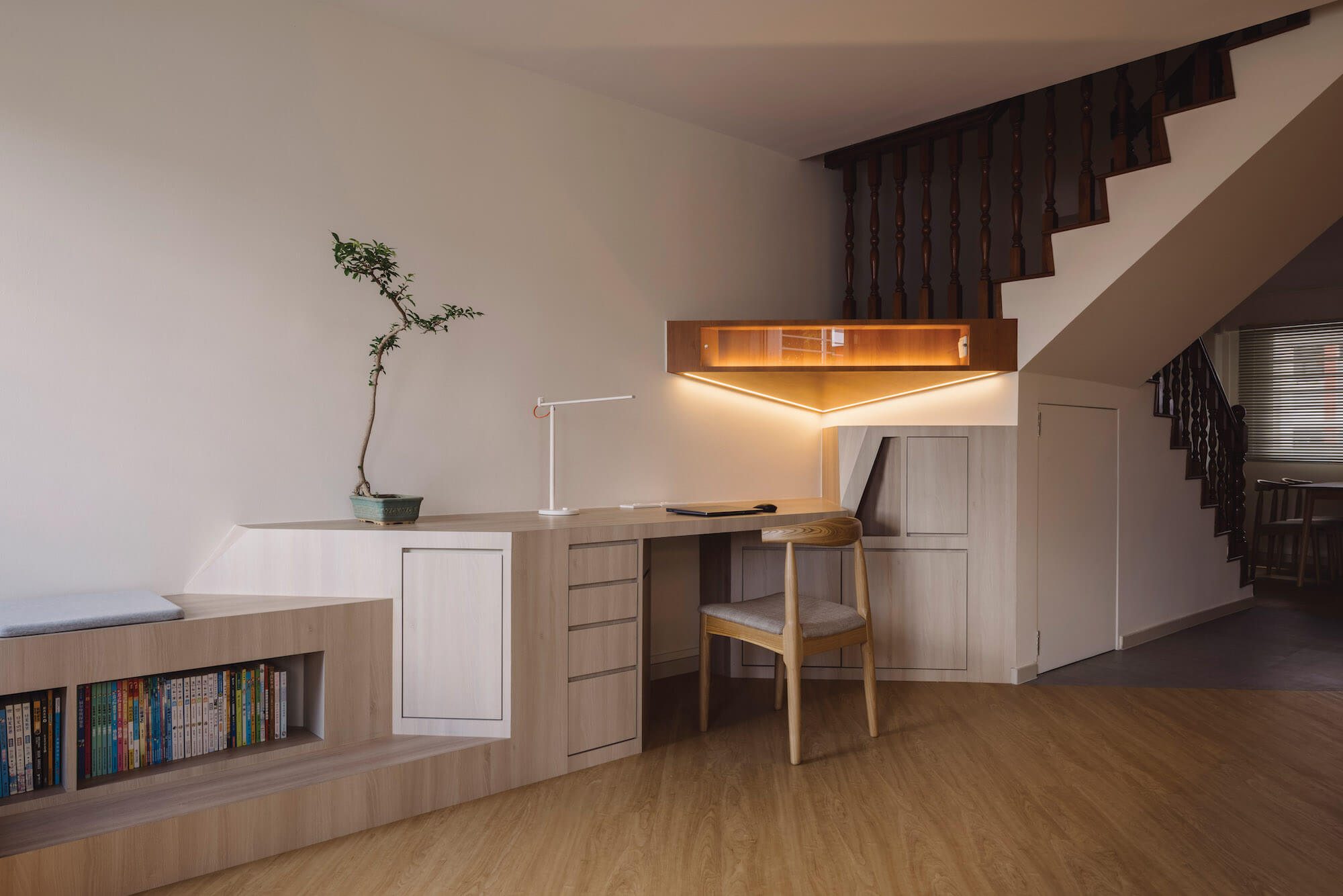
Bespoke cabinets and storage set a stylish tone in the children’s study area
Originally from China, the clients have now lived in Singapore for more than two decades, with their sons currently at primary and secondary school level. Forming the genesis of the project were two unique design requirements: to have the living room, the typically largest room in an apartment, crafted as a conducive study space for their boys; and to preserve the original dark teak staircase in the property.
Well-maintained by the apartment’s previous owners, the staircase was constructed of of very high quality wood, which had been very popular in HDB maisonettes in the 1980s. While a more conventional design approach would have been to re-finish the antique-looking teak and replace the ornate balustrades, the owners’ fondness for it led instead to a conservational mindset.
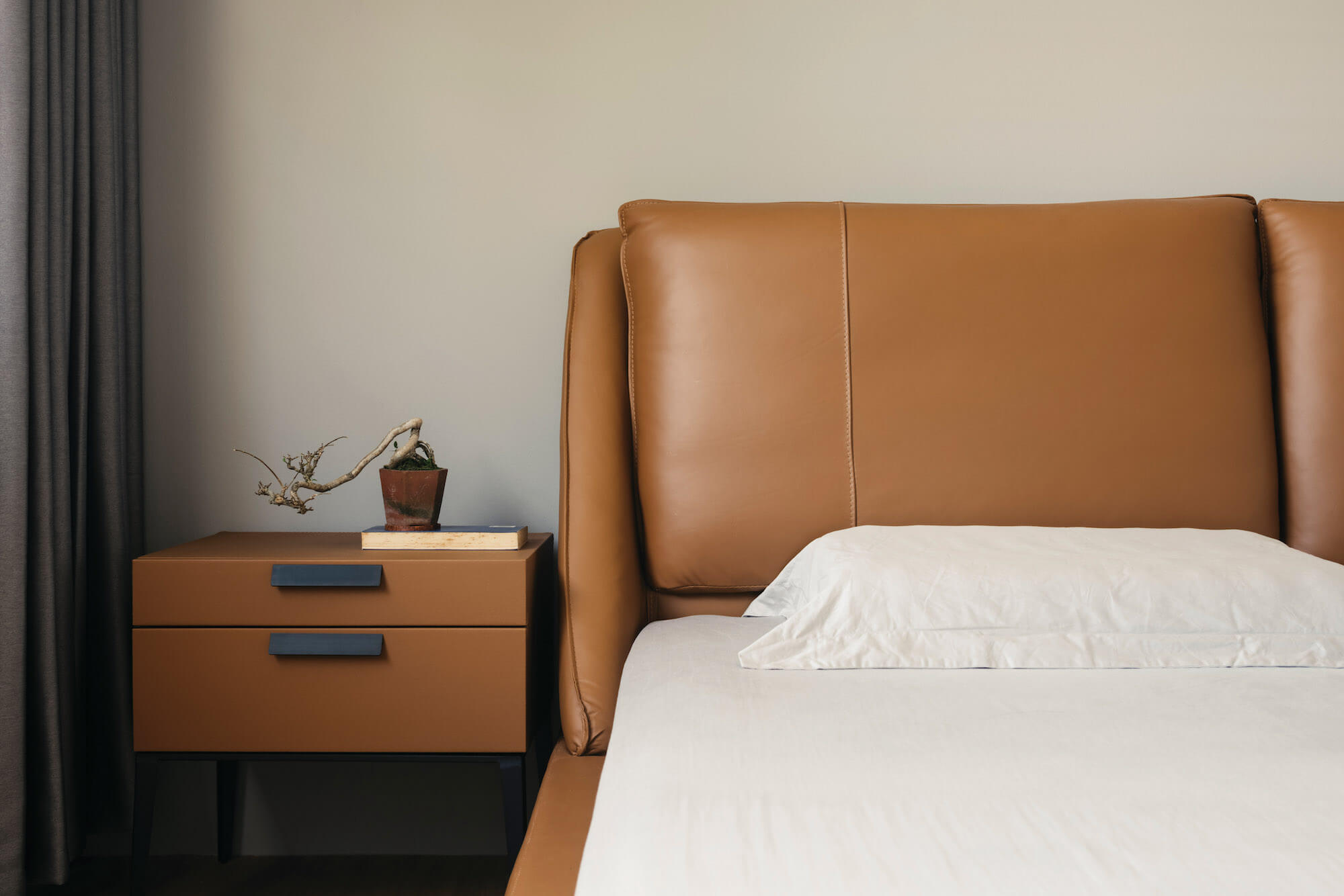
In the master bedroom, a sumptuous leather bed and headboard add a touch of luxury
This in turn generated two design gestures to bridge this vintage element into the new design for the apartment. At its mid-landing, Metre Architects crafted a triangular cabinet in the closest matching laminate to the teakwood, extending it beyond the balustrade “like new growth sprouting from an old teak tree”.
This triangular cabinet also became the ideal location to house the wifi router in the apartment. The designers took the inclined geometry of the staircase and drew a converging diagonal line from the wall across, which became a ‘threshold cabinet’ that doubles as a privacy screen to shield direct views from the main door.
This skewed cabinet forms a polygonal portal with the staircase and sculpts the double-volume stairwell as a triangular courtyard, delineating the front dining area from the study space at the back, and enriching the spatial layering of the rectangular floor plan.
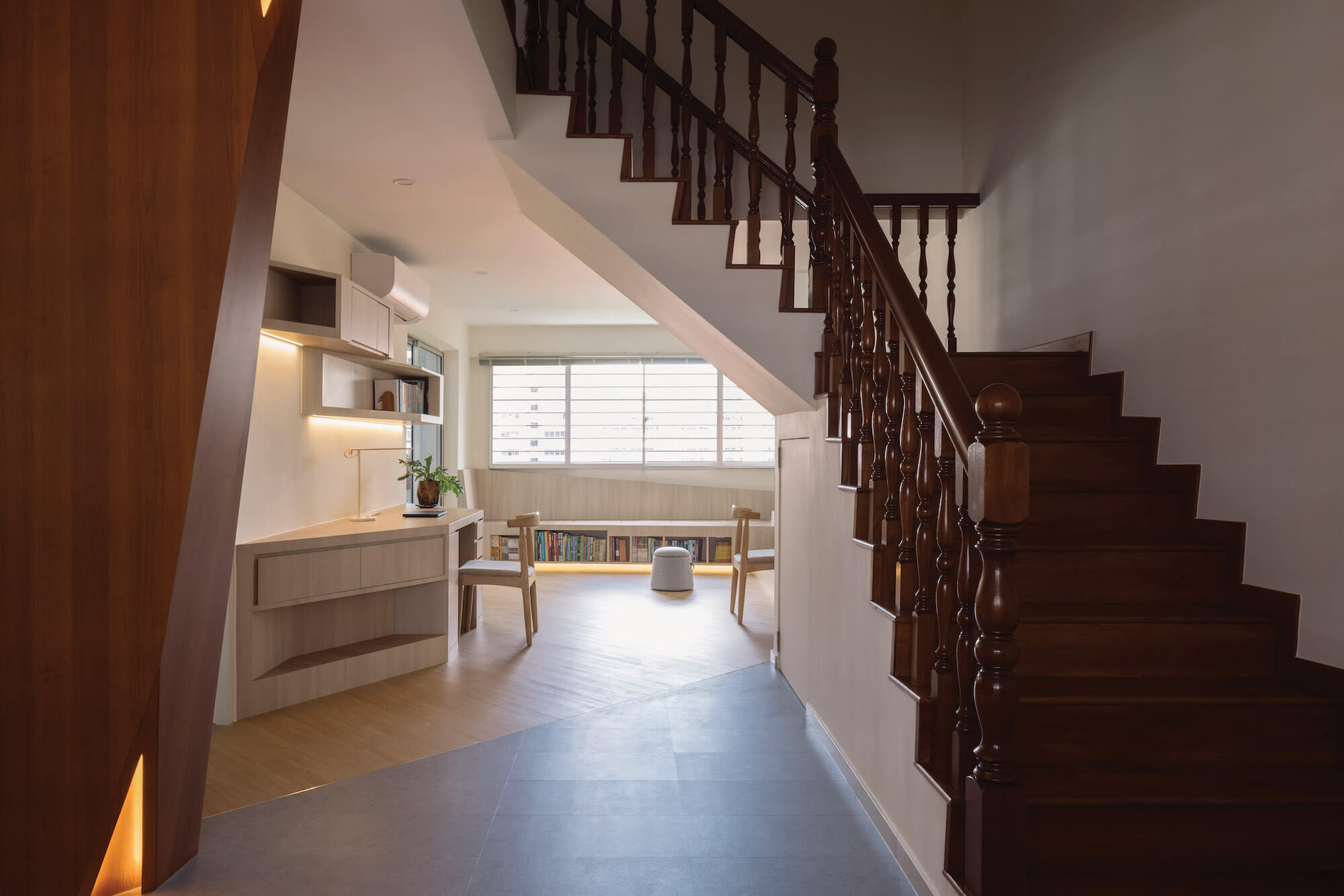
The owners wanted to conserve the existing, rather old-fashioned, teak staircase, having fallen for its charms
Diagonal lines found their rightful place through considerations of ergonomics (to whit: the body manoeuvres more easily around a slanted corner than a right-angled one) in the main space with two study tables, one of which cascades into a seating bookshelf.
Since moving into this apartment, the family reports they spend more time together compared to previously, when they tended to dwell more in their own individual rooms. This strongly suggests that in this era of ever-increasing time spent online, design is still able to steer awareness towards physical spaces, to return the mind to the here and now.
Project: Converging Space
Location: Singapore
Design firm: Metre Architects | metre.sg/
Project size: 148 sq-m
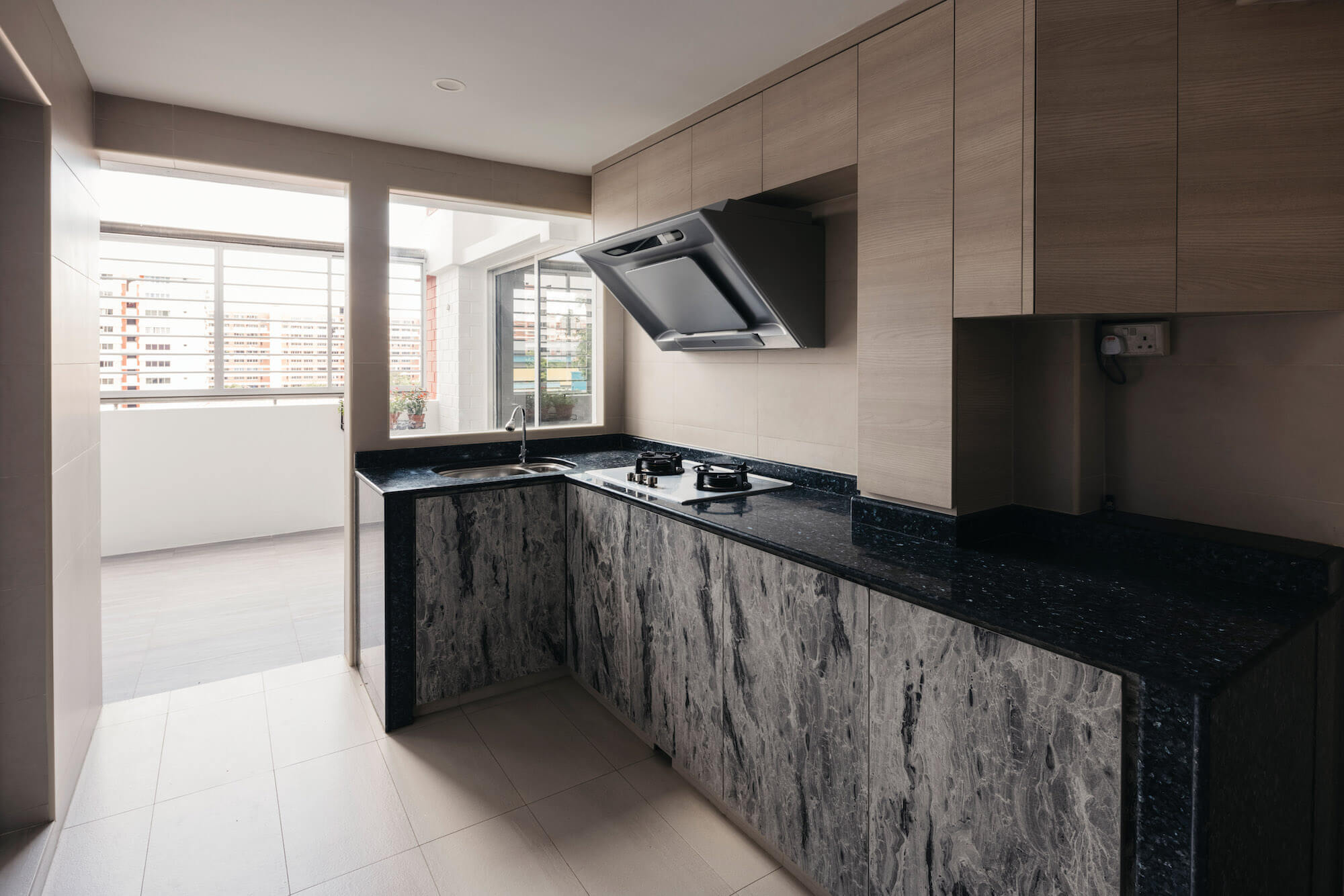
The sleek kitchen, dominated by stone and marble, opens out onto the airy terrace
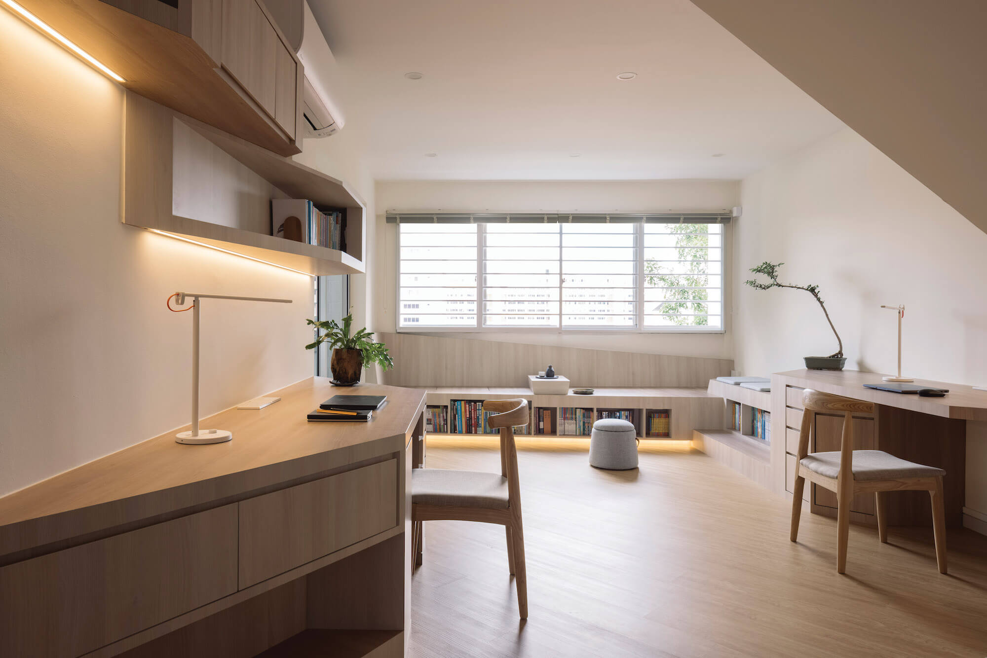
Unusually, the living room — traditionally the largest space in the home — was given over to become the children’s study
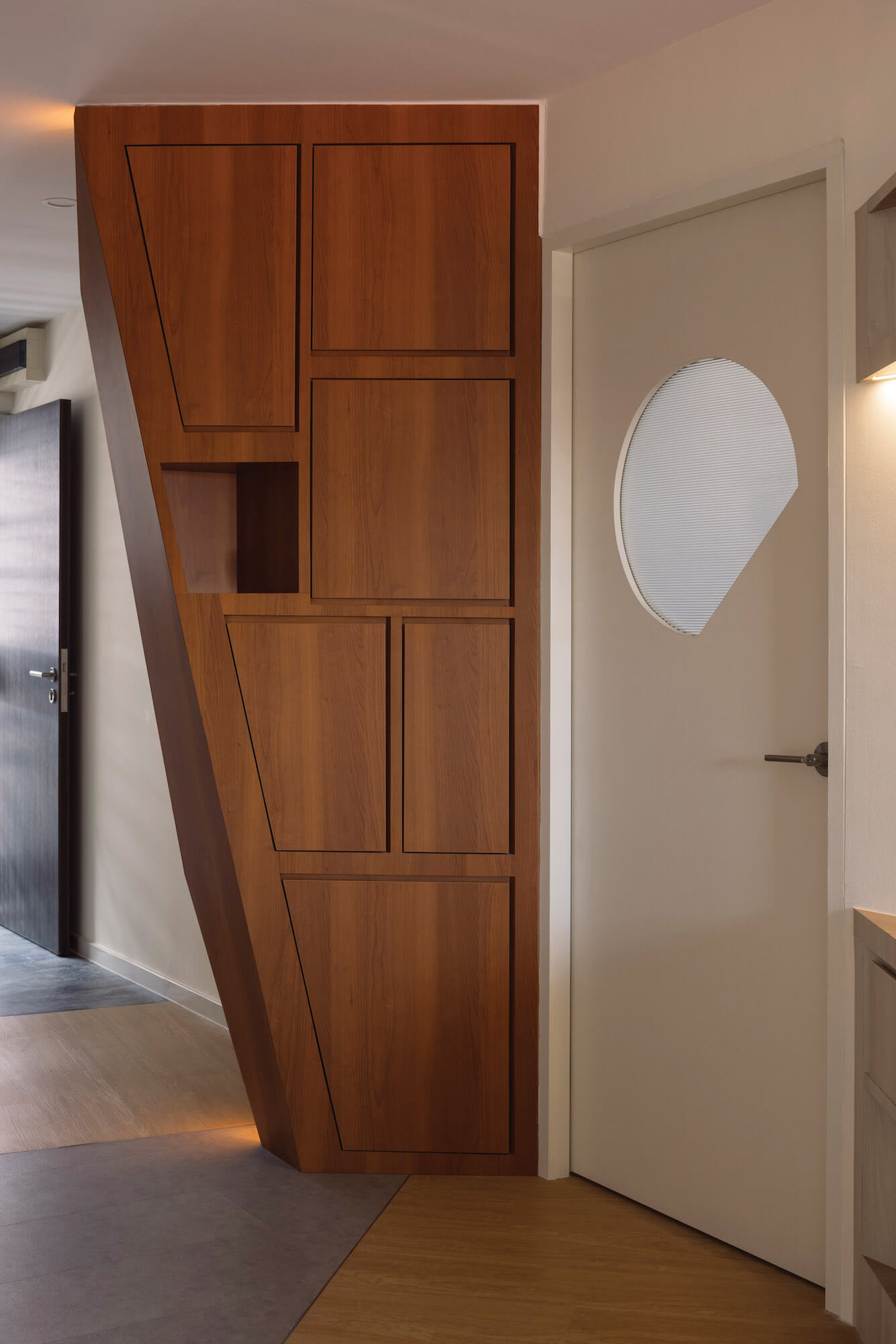
A ‘threshold cabinet’ doubles as a privacy screen to shield direct views from the main door
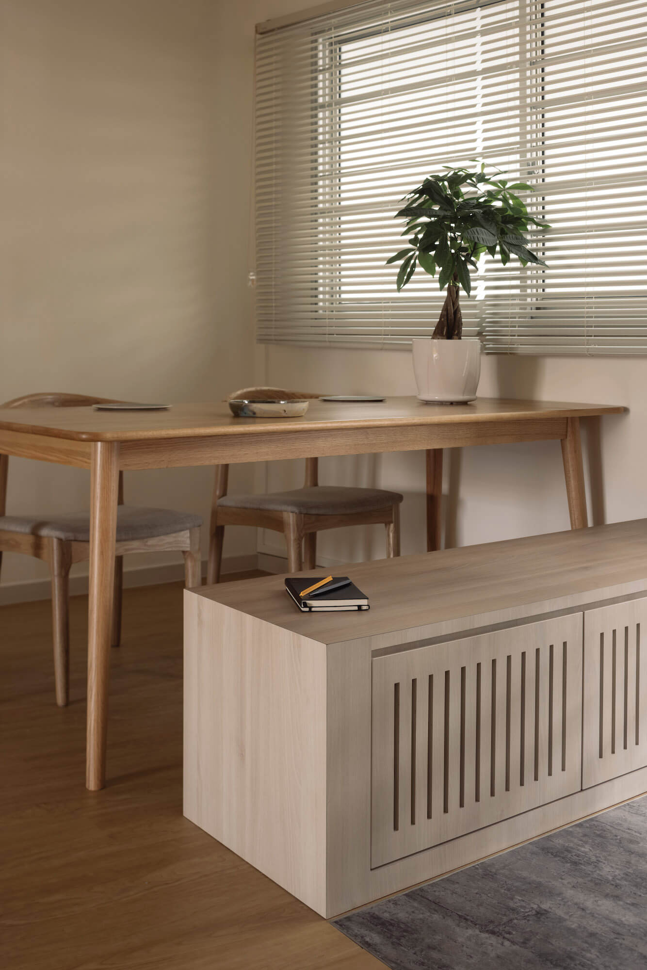
Pale wood dominates the materials palette, providing a strong contrast to the teak staircase
