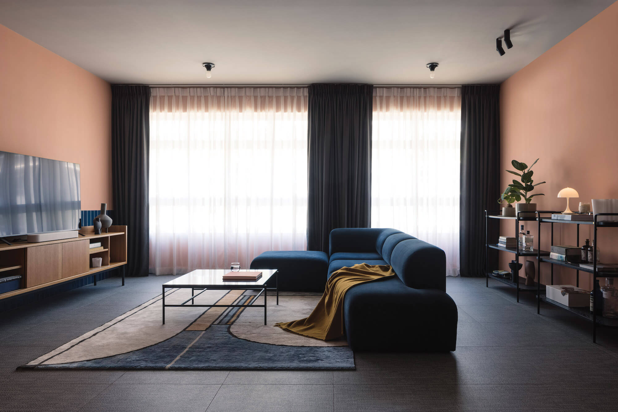
In the sitting room, pieces include Bolia’s Angle sofa, Hay’s Rebar coffee table, Grado’s Lin cabinet and Commune’s Jarl shelving units
When a client asks for something that’s not your run-of-the-mill neutral palette, it can seem daunting — but it’s also an exciting challenge, as Shed Studio co-founders Sheena Sim and Edmund Ong point out. As the creative leads on the project to revamp an apartment in Tampines, “the main challenge lay in mixing all the colours, textures and materials in a cohesive way so that at every angle you turn to, there’s always a visual treat”, they say.
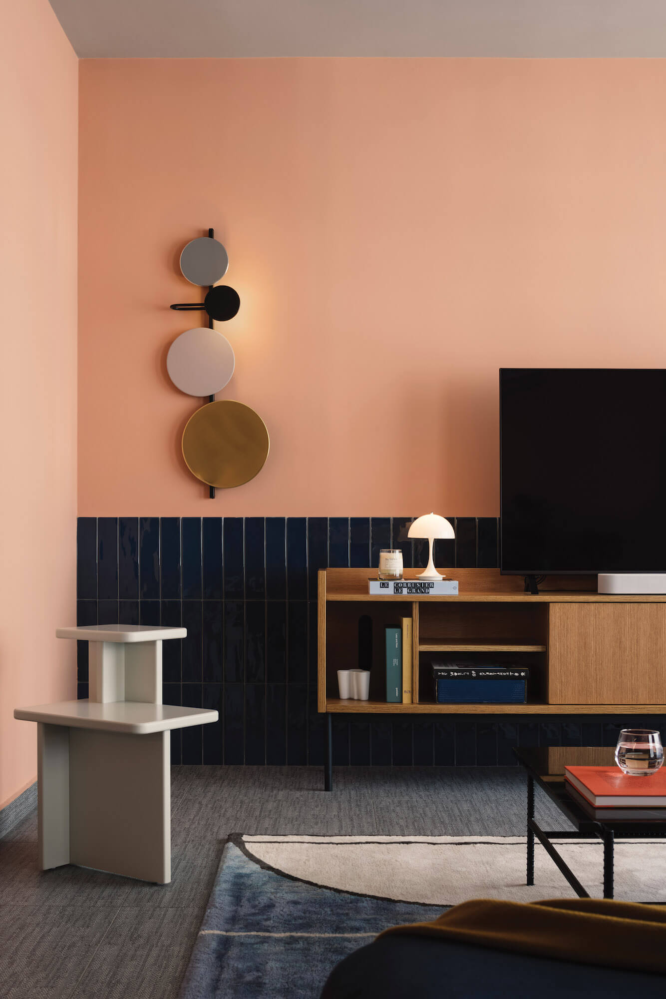
One the wall, the Planet lamp designed by Mette Schelde for Please Wait To Be Seated has discs attached by magnets — these can be moved around to create different patterns
How were the design choices/style determined, in particular the colour palette?
It came mainly from the clients’ brief. They are well travelled and adventurous enough to request a mixture of colours and materials throughout the house. We compiled a series of images to get a sense of their preferences and boundaries, and made it a point then to incorporate bold colours, patterns and textures throughout the home.
The scheme has a wonderful, almost 1950s-like vibe that feels so retro that it’s almost futuristic. Where did this vision come from?
As designers, we do have a penchant for old things. Although we didn’t specifically intend for this project to have a retro vibe, it does come through from the usage of materials and fixtures that were prevalent in the ’50s and ’60s, such as the glass blocks and the Teti lamps designed by Vico Magistretti in 1967.
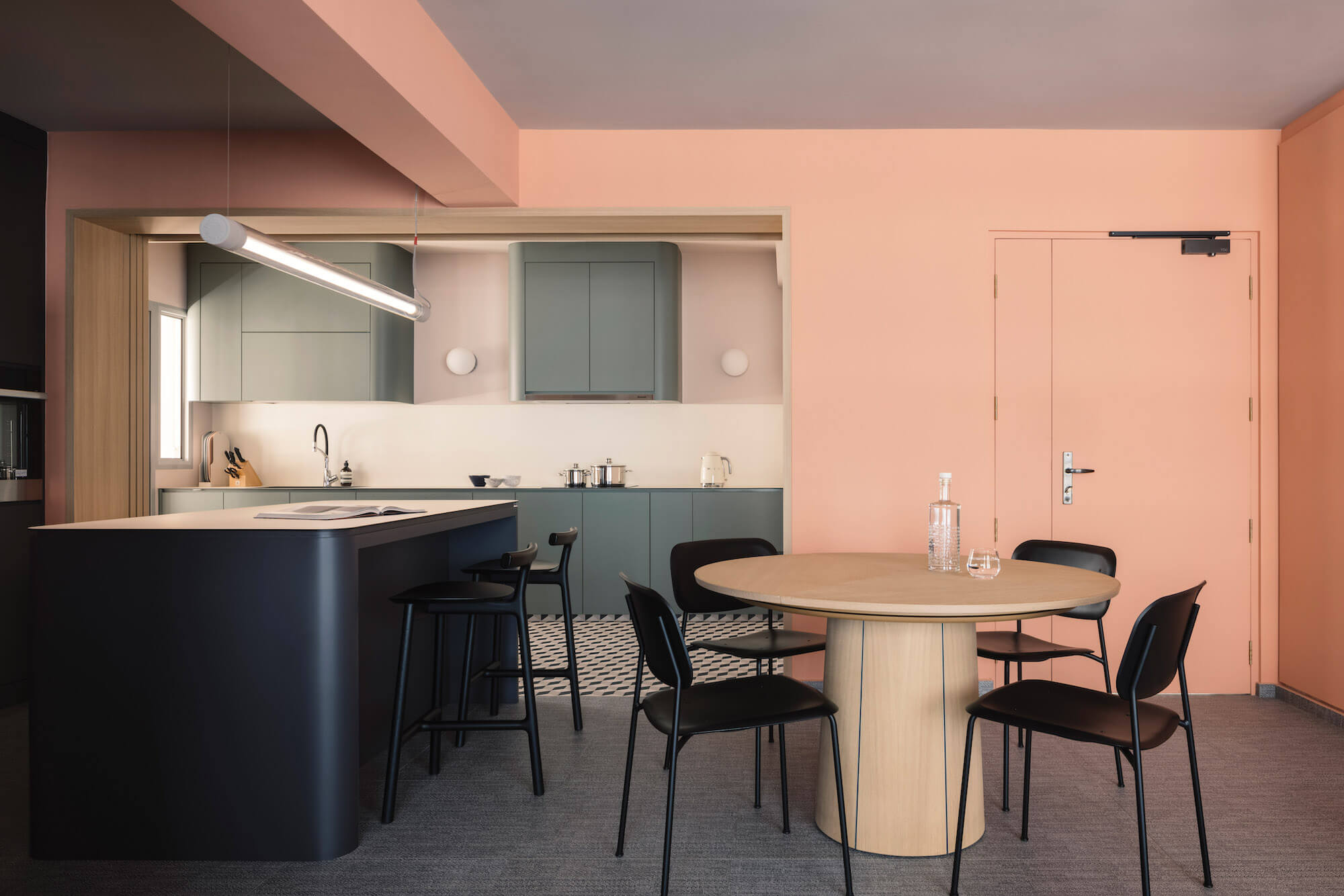
The open-plan kitchen diner features the #33 dining table by Skovby, paired with Hay’s Soft Edge P10 chairs
Were any structural layout changes made, for example the removal of walls to make a bigger, more open-plan feel?
There was a minor layout change made to combine the master bedroom with the adjacent room to create a walk-in-wardrobe. The rest of the house retained its original structure.
It is, overall, a triumph of classic and contemporary, melded by cleverly-chosen colours and furnishings.
Shed Studio | www.shedstudio.sg/
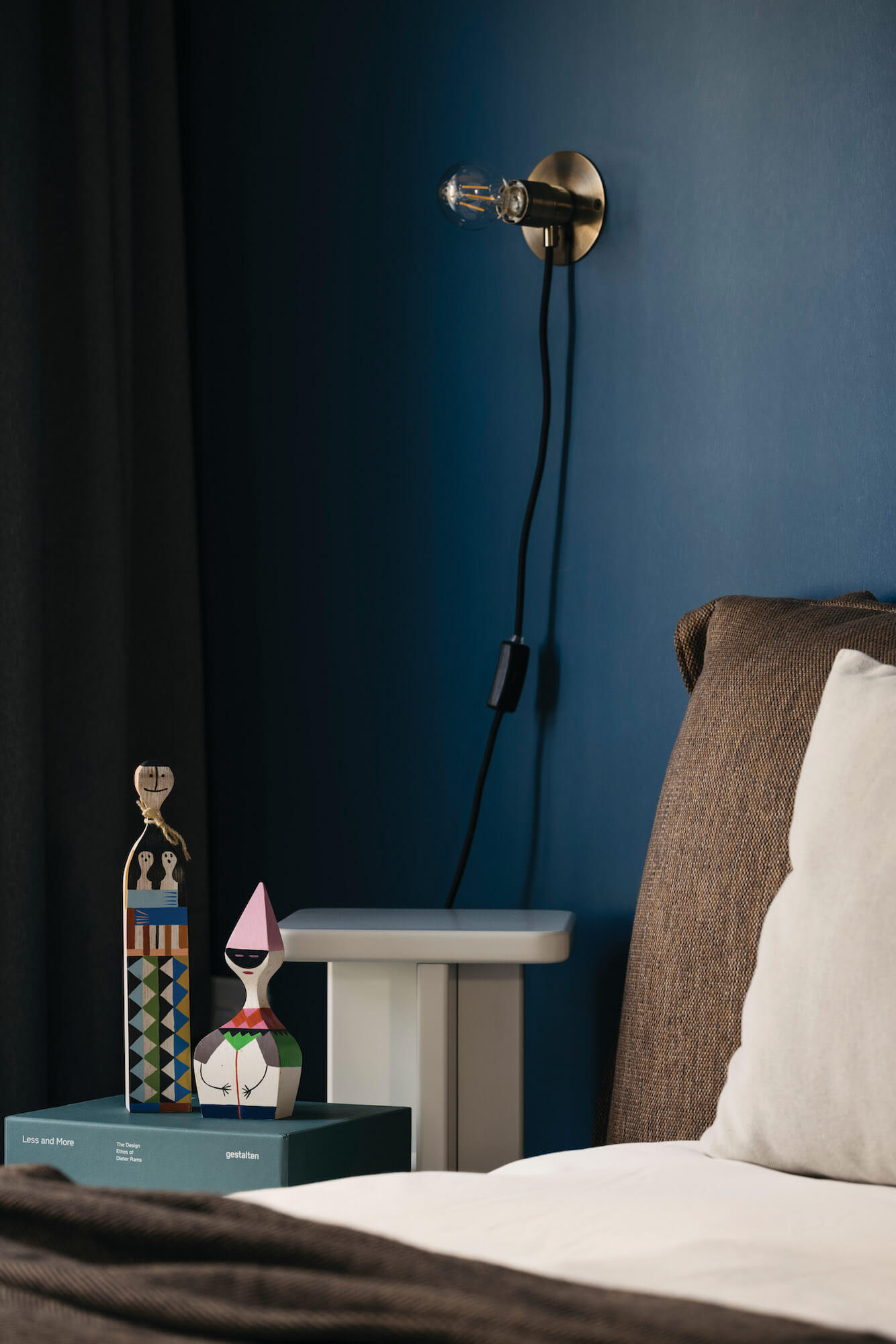
Frama’s sleek E27 wall lamp sit above Grado’s Cross side table
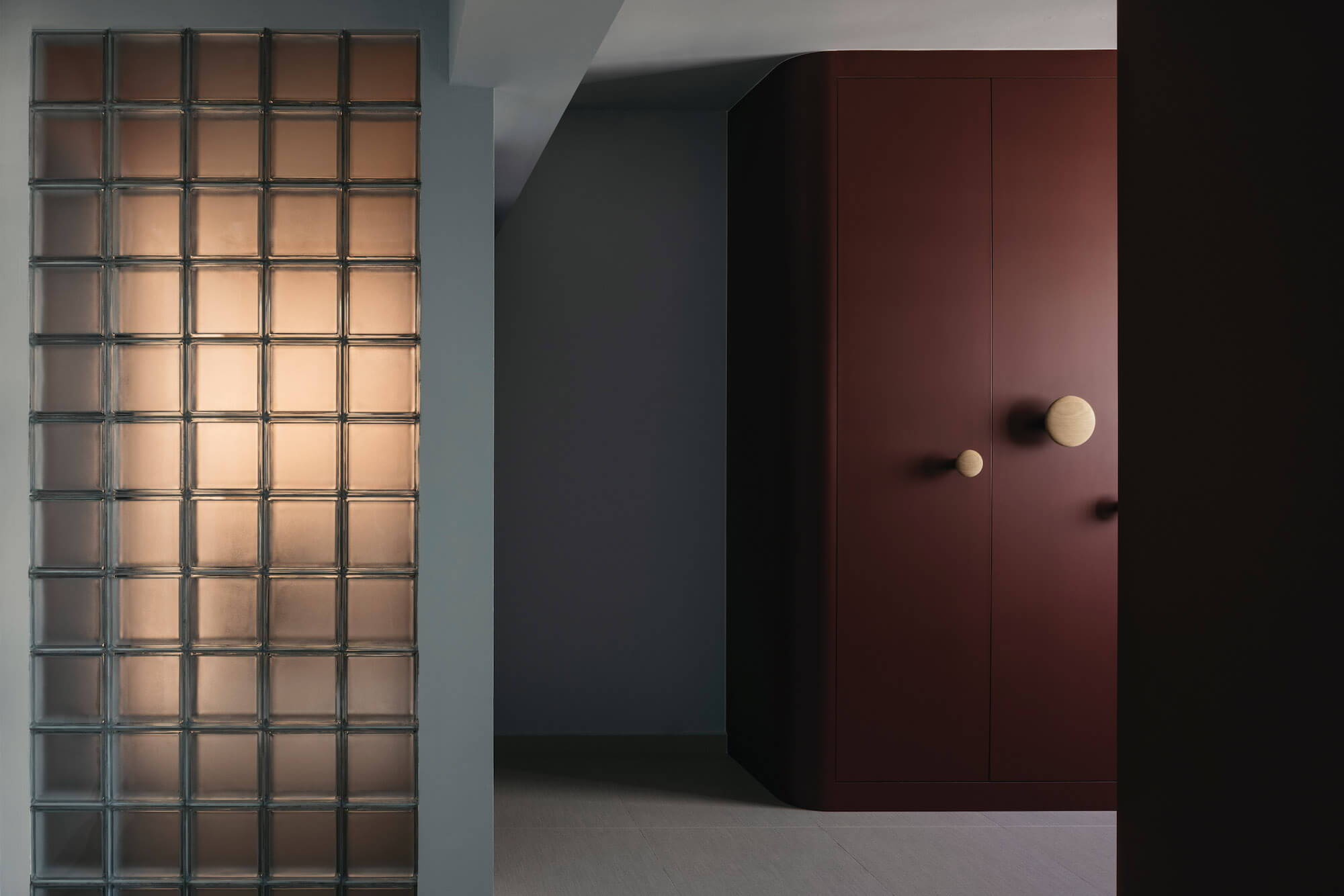
Glass cubes provide contrast against Muuto’s Dots wooden coat hooks, here acting also as wardrobe handles

A pair of TR Bulb wall lamps by Menu add a quirky touch in the kitchen
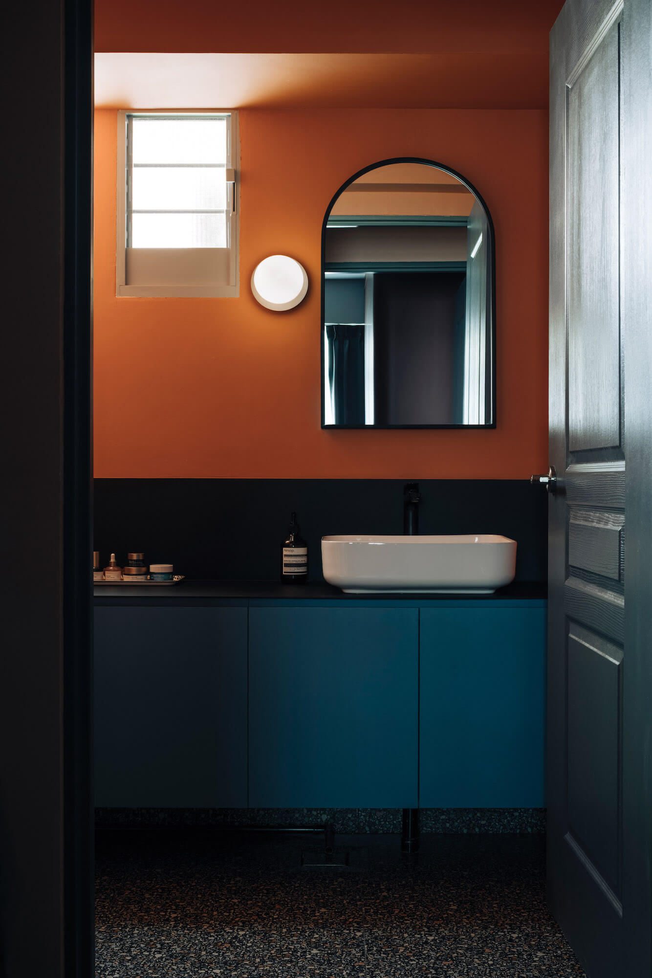
The Liila wall lamp by Nuura lends a soft glow to the warm orange of the walls, which contrasts with the rich dark teals and blue of the cabinetry and door
